Watch Now This tutorial has a related video course created by the Real Python team. Watch it together with the written tutorial to deepen your understanding: Plot With pandas: Python Data Visualization Basics
Whether you’re just getting to know a dataset or preparing to publish your findings, visualization is an essential tool. Python’s popular data analysis library, pandas, provides several different options for visualizing your data with .plot(). Even if you’re at the beginning of your pandas journey, you’ll soon be creating basic plots that will yield valuable insights into your data.
In this tutorial, you’ll learn:
- What the different types of pandas plots are and when to use them
- How to get an overview of your dataset with a histogram
- How to discover correlation with a scatter plot
- How to analyze different categories and their ratios
Free Bonus: Click here to get access to a Conda cheat sheet with handy usage examples for managing your Python environment and packages.
Set Up Your Environment
You can best follow along with the code in this tutorial in a Jupyter Notebook. This way, you’ll immediately see your plots and be able to play around with them.
You’ll also need a working Python environment including pandas. If you don’t have one yet, then you have several options:
-
If you have more ambitious plans, then download the Anaconda distribution. It’s huge (around 500 MB), but you’ll be equipped for most data science work.
-
If you prefer a minimalist setup, then check out the section on installing Miniconda in Setting Up Python for Machine Learning on Windows.
-
If you want to stick to
pip, then install the libraries discussed in this tutorial withpip install pandas matplotlib. You can also grab Jupyter Notebook withpip install jupyterlab. -
If you don’t want to do any setup, then follow along in an online Jupyter Notebook trial.
Once your environment is set up, you’re ready to download a dataset. In this tutorial, you’re going to analyze data on college majors sourced from the American Community Survey 2010–2012 Public Use Microdata Sample. It served as the basis for the Economic Guide To Picking A College Major featured on the website FiveThirtyEight.
First, download the data by passing the download URL to pandas.read_csv():
In [1]: import pandas as pd

In [2]: download_url = (
   ...:     "https://raw.githubusercontent.com/fivethirtyeight/"
   ...:     "data/master/college-majors/recent-grads.csv"
   ...: )

In [3]: df = pd.read_csv(download_url)

In [4]: type(df)
Out[4]: pandas.core.frame.DataFrame
By calling read_csv(), you create a DataFrame, which is the main data structure used in pandas.
Note: You can follow along with this tutorial even if you aren’t familiar with DataFrames. But if you’re interested in learning more about working with pandas and DataFrames, then you can check out Using Pandas and Python to Explore Your Dataset and The Pandas DataFrame: Make Working With Data Delightful.
Now that you have a DataFrame, you can take a look at the data. First, you should configure the display.max.columns option to make sure pandas doesn’t hide any columns. Then you can view the first few rows of data with .head():
In [5]: pd.set_option("display.max.columns", None)

In [6]: df.head()
You’ve just displayed the first five rows of the DataFrame df using .head(). Your output should look like this:
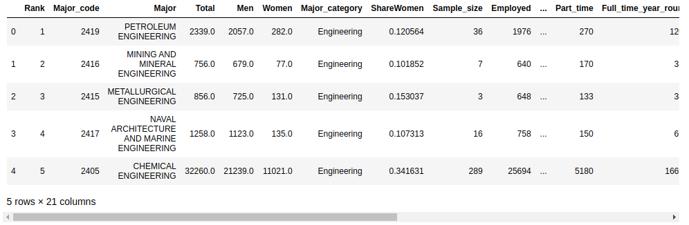
The default number of rows displayed by .head() is five, but you can specify any number of rows as an argument. For example, to display the first ten rows, you would use df.head(10).
Create Your First Pandas Plot
Your dataset contains some columns related to the earnings of graduates in each major:
"Median"is the median earnings of full-time, year-round workers."P25th"is the 25th percentile of earnings."P75th"is the 75th percentile of earnings."Rank"is the major’s rank by median earnings.
Let’s start with a plot displaying these columns. First, you need to set up your Jupyter Notebook to display plots with the %matplotlib magic command:
In [7]: %matplotlib
Using matplotlib backend: MacOSX
The %matplotlib magic command sets up your Jupyter Notebook for displaying plots with Matplotlib. The standard Matplotlib graphics backend is used by default, and your plots will be displayed in a separate window.
Note: You can change the Matplotlib backend by passing an argument to the %matplotlib magic command.
For example, the inline backend is popular for Jupyter Notebooks because it displays the plot in the notebook itself, immediately below the cell that creates the plot:
In [7]: %matplotlib inline
There are a number of other backends available. For more information, check out the Rich Outputs tutorial in the IPython documentation.
Now you’re ready to make your first plot! You can do so with .plot():
In [8]: df.plot(x="Rank", y=["P25th", "Median", "P75th"])
Out[8]: <AxesSubplot:xlabel='Rank'>
.plot() returns a line graph containing data from every row in the DataFrame. The x-axis values represent the rank of each institution, and the "P25th", "Median", and "P75th" values are plotted on the y-axis.
Note: If you aren’t following along in a Jupyter Notebook or in an IPython shell, then you’ll need to use the pyplot interface from matplotlib to display the plot.
Here’s how to show the figure in a standard Python shell:
>>> import matplotlib.pyplot as plt
>>> df.plot(x="Rank", y=["P25th", "Median", "P75th"])
>>> plt.show()
Notice that you must first import the pyplot module from Matplotlib before calling plt.show() to display the plot.
The figure produced by .plot() is displayed in a separate window by default and looks like this:

Looking at the plot, you can make the following observations:
-
The median income decreases as rank decreases. This is expected because the rank is determined by the median income.
-
Some majors have large gaps between the 25th and 75th percentiles. People with these degrees may earn significantly less or significantly more than the median income.
-
Other majors have very small gaps between the 25th and 75th percentiles. People with these degrees earn salaries very close to the median income.
Your first plot already hints that there’s a lot more to discover in the data! Some majors have a wide range of earnings, and others have a rather narrow range. To discover these differences, you’ll use several other types of plots.
Note: For an introduction to medians, percentiles, and other statistics, check out Python Statistics Fundamentals: How to Describe Your Data.
.plot() has several optional parameters. Most notably, the kind parameter accepts eleven different string values and determines which kind of plot you’ll create:
"area"is for area plots."bar"is for vertical bar charts."barh"is for horizontal bar charts."box"is for box plots."hexbin"is for hexbin plots."hist"is for histograms."kde"is for kernel density estimate charts."density"is an alias for"kde"."line"is for line graphs."pie"is for pie charts."scatter"is for scatter plots.
The default value is "line". Line graphs, like the one you created above, provide a good overview of your data. You can use them to detect general trends. They rarely provide sophisticated insight, but they can give you clues as to where to zoom in.
If you don’t provide a parameter to .plot(), then it creates a line plot with the index on the x-axis and all the numeric columns on the y-axis. While this is a useful default for datasets with only a few columns, for the college majors dataset and its several numeric columns, it looks like quite a mess.
Note: As an alternative to passing strings to the kind parameter of .plot(), DataFrame objects have several methods that you can use to create the various kinds of plots described above:
In this tutorial, you’ll use the .plot() interface and pass strings to the kind parameter. You’re encouraged to try out the methods mentioned above as well.
Now that you’ve created your first pandas plot, let’s take a closer look at how .plot() works.
Look Under the Hood: Matplotlib
When you call .plot() on a DataFrame object, Matplotlib creates the plot under the hood.
To verify this, try out two code snippets. First, create a plot with Matplotlib using two columns of your DataFrame:
In [9]: import matplotlib.pyplot as plt

In [10]: plt.plot(df["Rank"], df["P75th"])
Out[10]: [<matplotlib.lines.Line2D at 0x7f859928fbb0>]
First, you import the matplotlib.pyplot module and rename it to plt. Then you call plot() and pass the DataFrame object’s "Rank" column as the first argument and the "P75th" column as the second argument.
The result is a line graph that plots the 75th percentile on the y-axis against the rank on the x-axis:

You can create exactly the same graph using the DataFrame object’s .plot() method:
In [11]: df.plot(x="Rank", y="P75th")
Out[11]: <AxesSubplot:xlabel='Rank'>
.plot() is a wrapper for pyplot.plot(), and the result is a graph identical to the one you produced with Matplotlib:
You can use both pyplot.plot() and df.plot() to produce the same graph from columns of a DataFrame object. However, if you already have a DataFrame instance, then df.plot() offers cleaner syntax than pyplot.plot().
Note: If you’re already familiar with Matplotlib, then you may be interested in the kwargs parameter to .plot(). You can pass to it a dictionary containing keyword arguments that will then get passed to the Matplotlib plotting backend.
For more information on Matplotlib, check out Python Plotting With Matplotlib.
Now that you know that the DataFrame object’s .plot() method is a wrapper for Matplotlib’s pyplot.plot(), let’s dive into the different kinds of plots you can create and how to make them.
Survey Your Data
The next plots will give you a general overview of a specific column of your dataset. First, you’ll have a look at the distribution of a property with a histogram. Then you’ll get to know some tools to examine the outliers.
Distributions and Histograms
DataFrame is not the only class in pandas with a .plot() method. As so often happens in pandas, the Series object provides similar functionality.
You can get each column of a DataFrame as a Series object. Here’s an example using the "Median" column of the DataFrame you created from the college major data:
In [12]: median_column = df["Median"]

In [13]: type(median_column)
Out[13]: pandas.core.series.Series
Now that you have a Series object, you can create a plot for it. A histogram is a good way to visualize how values are distributed across a dataset. Histograms group values into bins and display a count of the data points whose values are in a particular bin.
Let’s create a histogram for the "Median" column:
In [14]: median_column.plot(kind="hist")
Out[14]: <AxesSubplot:ylabel='Frequency'>
You call .plot() on the median_column Series and pass the string "hist" to the kind parameter. That’s all there is to it!
When you call .plot(), you’ll see the following figure:
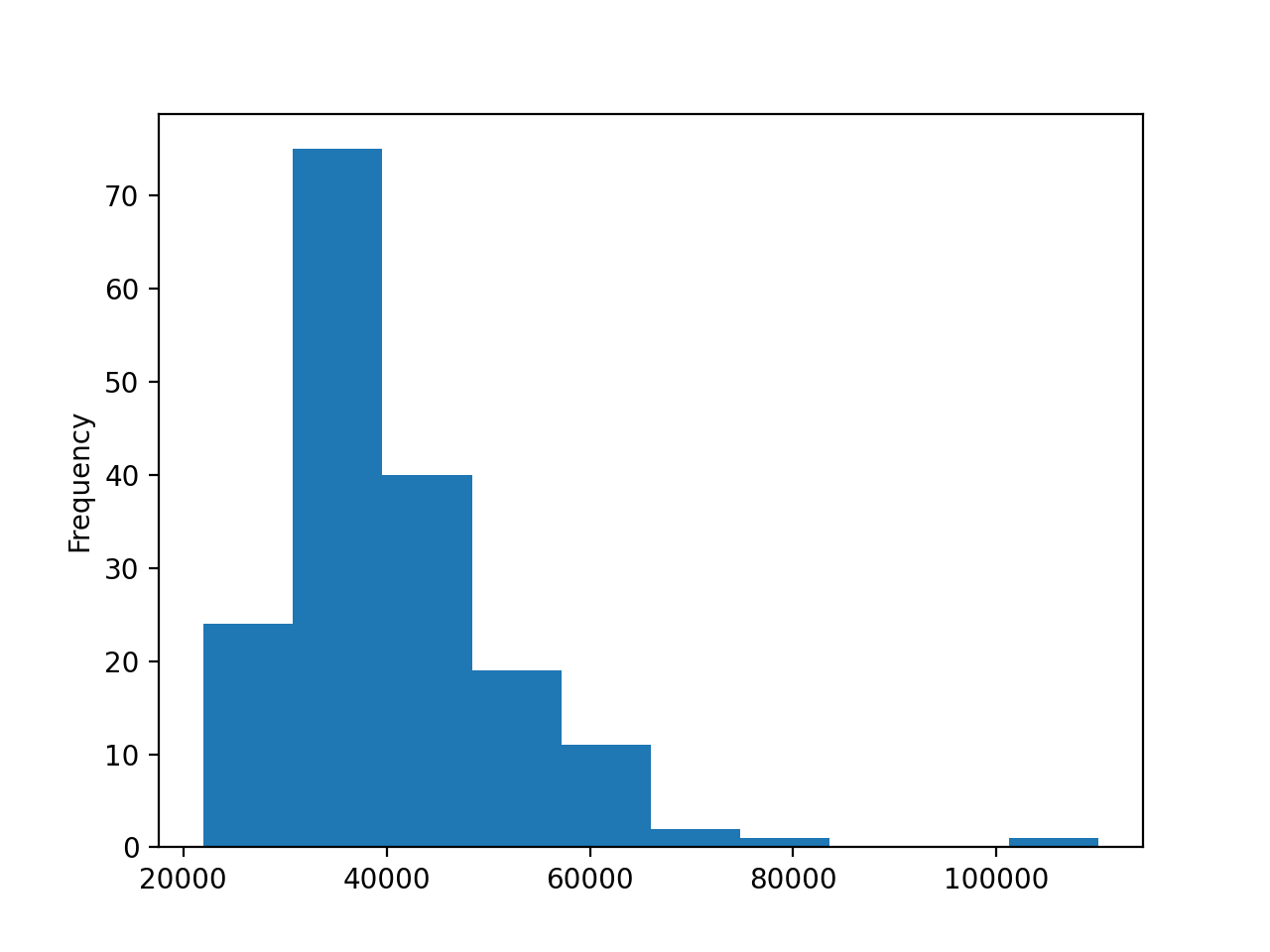
The histogram shows the data grouped into ten bins ranging from $20,000 to $120,000, and each bin has a width of $10,000. The histogram has a different shape than the normal distribution, which has a symmetric bell shape with a peak in the middle.
Note: For more information about histograms, check out Python Histogram Plotting: NumPy, Matplotlib, Pandas & Seaborn.
The histogram of the median data, however, peaks on the left below $40,000. The tail stretches far to the right and suggests that there are indeed fields whose majors can expect significantly higher earnings.
Outliers
Have you spotted that lonely small bin on the right edge of the distribution? It seems that one data point has its own category. The majors in this field get an excellent salary compared not only to the average but also to the runner-up. Although this isn’t its main purpose, a histogram can help you to detect such an outlier. Let’s investigate the outlier a bit more:
- Which majors does this outlier represent?
- How big is its edge?
Contrary to the first overview, you only want to compare a few data points, but you want to see more details about them. For this, a bar plot is an excellent tool. First, select the five majors with the highest median earnings. You’ll need two steps:
- To sort by the
"Median"column, use.sort_values()and provide the name of the column you want to sort by as well as the directionascending=False. - To get the top five items of your list, use
.head().
Let’s create a new DataFrame called top_5:
In [15]: top_5 = df.sort_values(by="Median", ascending=False).head()
Now you have a smaller DataFrame containing only the top five most lucrative majors. As a next step, you can create a bar plot that shows only the majors with these top five median salaries:
In [16]: top_5.plot(x="Major", y="Median", kind="bar", rot=5, fontsize=4)
Out[16]: <AxesSubplot:xlabel='Major'>
Notice that you use the rot and fontsize parameters to rotate and size the labels of the x-axis so that they’re visible. You’ll see a plot with 5 bars:
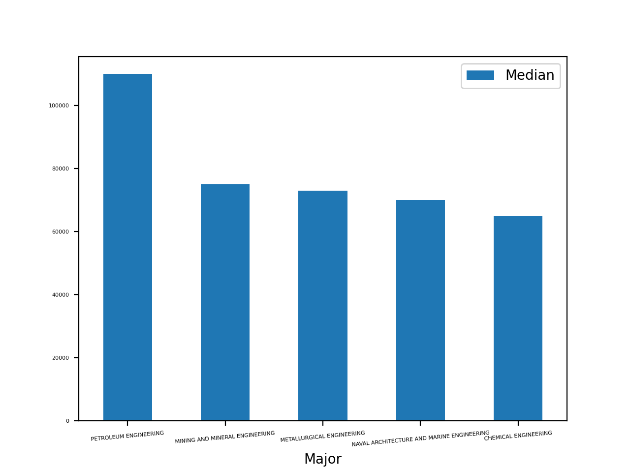
This plot shows that the median salary of petroleum engineering majors is more than $20,000 higher than the rest. The earnings for the second- through fourth-place majors are relatively close to one another.
If you have a data point with a much higher or lower value than the rest, then you’ll probably want to investigate a bit further. For example, you can look at the columns that contain related data.
Let’s investigate all majors whose median salary is above $60,000. First, you need to filter these majors with the mask df[df["Median"] > 60000]. Then you can create another bar plot showing all three earnings columns:
In [17]: top_medians = df[df["Median"] > 60000].sort_values("Median")

In [18]: top_medians.plot(x="Major", y=["P25th", "Median", "P75th"], kind="bar")
Out[18]: <AxesSubplot:xlabel='Major'>
You should see a plot with three bars per major, like this:
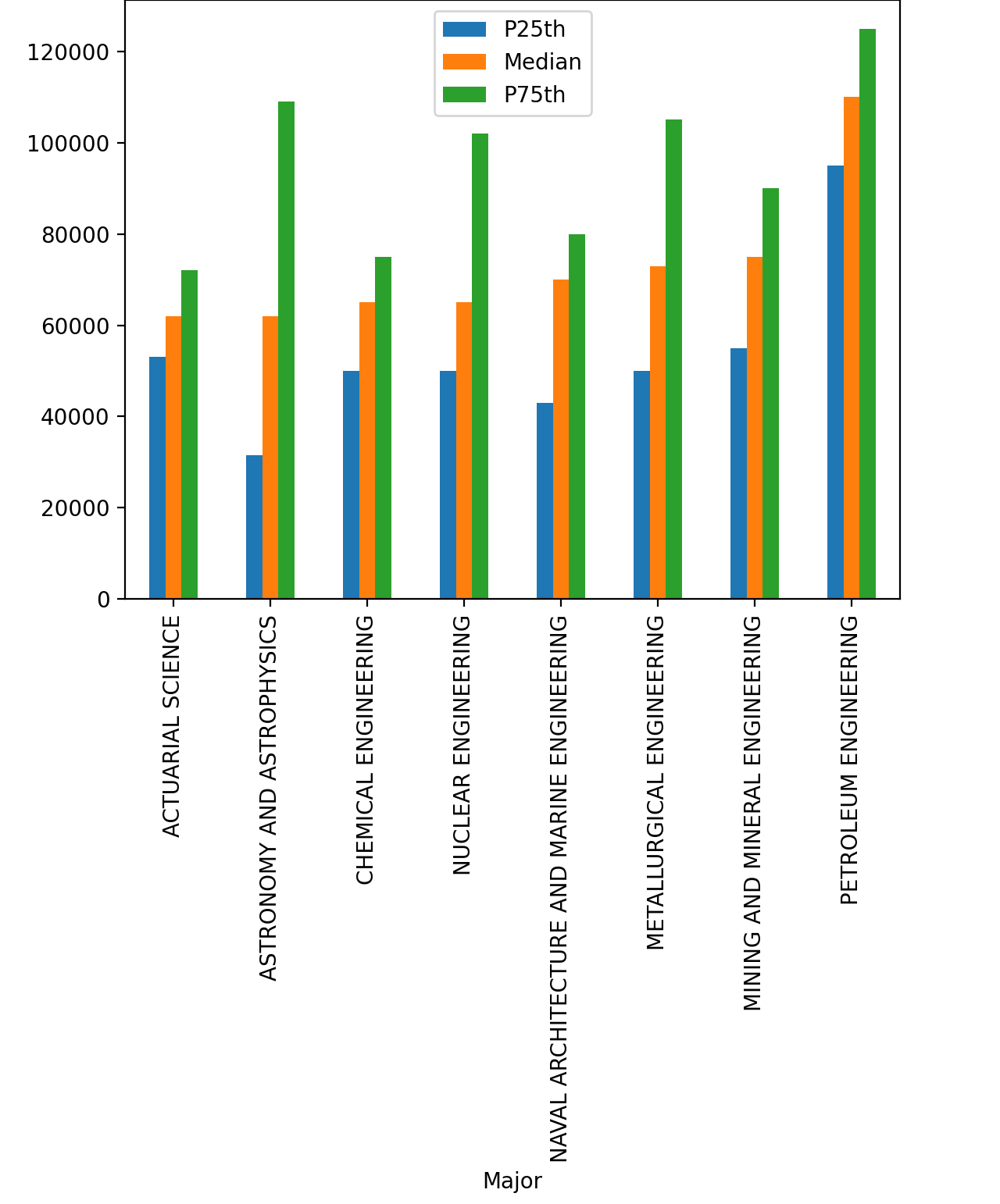
The 25th and 75th percentile confirm what you’ve seen above: petroleum engineering majors were by far the best paid recent graduates.
Why should you be so interested in outliers in this dataset? If you’re a college student pondering which major to pick, you have at least one pretty obvious reason. But outliers are also very interesting from an analysis point of view. They can indicate not only industries with an abundance of money but also invalid data.
Invalid data can be caused by any number of errors or oversights, including a sensor outage, an error during the manual data entry, or a five-year-old participating in a focus group meant for kids age ten and above. Investigating outliers is an important step in data cleaning.
Even if the data is correct, you may decide that it’s just so different from the rest that it produces more noise than benefit. Let’s assume you analyze the sales data of a small publisher. You group the revenues by region and compare them to the same month of the previous year. Then out of the blue, the publisher lands a national bestseller.
This pleasant event makes your report kind of pointless. With the bestseller’s data included, sales are going up everywhere. Performing the same analysis without the outlier would provide more valuable information, allowing you to see that in New York your sales numbers have improved significantly, but in Miami they got worse.
Check for Correlation
Often you want to see whether two columns of a dataset are connected. If you pick a major with higher median earnings, do you also have a lower chance of unemployment? As a first step, create a scatter plot with those two columns:
In [19]: df.plot(x="Median", y="Unemployment_rate", kind="scatter")
Out[19]: <AxesSubplot:xlabel='Median', ylabel='Unemployment_rate'>
You should see a quite random-looking plot, like this:
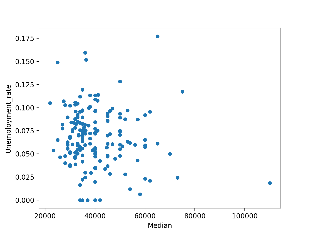
A quick glance at this figure shows that there’s no significant correlation between the earnings and unemployment rate.
While a scatter plot is an excellent tool for getting a first impression about possible correlation, it certainly isn’t definitive proof of a connection. For an overview of the correlations between different columns, you can use .corr(). If you suspect a correlation between two values, then you have several tools at your disposal to verify your hunch and measure how strong the correlation is.
Keep in mind, though, that even if a correlation exists between two values, it still doesn’t mean that a change in one would result in a change in the other. In other words, correlation does not imply causation.
Analyze Categorical Data
To process bigger chunks of information, the human mind consciously and unconsciously sorts data into categories. This technique is often useful, but it’s far from flawless.
Sometimes we put things into a category that, upon further examination, aren’t all that similar. In this section, you’ll get to know some tools for examining categories and verifying whether a given categorization makes sense.
Many datasets already contain some explicit or implicit categorization. In the current example, the 173 majors are divided into 16 categories.
Grouping
A basic usage of categories is grouping and aggregation. You can use .groupby() to determine how popular each of the categories in the college major dataset are:
In [20]: cat_totals = df.groupby("Major_category")["Total"].sum().sort_values()

In [21]: cat_totals
Out[21]:
Major_category
Interdisciplinary                        12296.0
Agriculture & Natural Resources          75620.0
Law & Public Policy                     179107.0
Physical Sciences                       185479.0
Industrial Arts & Consumer Services     229792.0
Computers & Mathematics                 299008.0
Arts                                    357130.0
Communications & Journalism             392601.0
Biology & Life Science                  453862.0
Health                                  463230.0
Psychology & Social Work                481007.0
Social Science                          529966.0
Engineering                             537583.0
Education                               559129.0
Humanities & Liberal Arts               713468.0
Business                               1302376.0
Name: Total, dtype: float64
With .groupby(), you create a DataFrameGroupBy object. With .sum(), you create a Series.
Let’s draw a horizontal bar plot showing all the category totals in cat_totals:
In [22]: cat_totals.plot(kind="barh", fontsize=4)
Out[22]: <AxesSubplot:ylabel='Major_category'>
You should see a plot with one horizontal bar for each category:
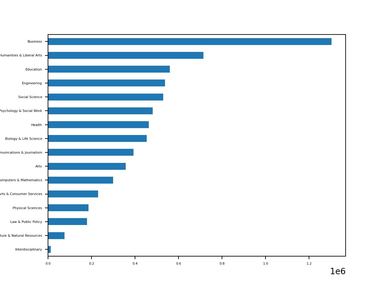
As your plot shows, business is by far the most popular major category. While humanities and liberal arts is the clear second, the rest of the fields are more similar in popularity.
Note: A column containing categorical data not only yields valuable insight for analysis and visualization, it also provides an opportunity to improve the performance of your code.
Determining Ratios
Vertical and horizontal bar charts are often a good choice if you want to see the difference between your categories. If you’re interested in ratios, then pie plots are an excellent tool. However, since cat_totals contains a few smaller categories, creating a pie plot with cat_totals.plot(kind="pie") will produce several tiny slices with overlapping labels .
To address this problem, you can lump the smaller categories into a single group. Merge all categories with a total under 100,000 into a category called "Other", then create a pie plot:
In [23]: small_cat_totals = cat_totals[cat_totals < 100_000]

In [24]: big_cat_totals = cat_totals[cat_totals > 100_000]

In [25]: # Adding a new item "Other" with the sum of the small categories

In [26]: small_sums = pd.Series([small_cat_totals.sum()], index=["Other"])

In [27]: big_cat_totals = big_cat_totals.append(small_sums)

In [28]: big_cat_totals.plot(kind="pie", label="")
Out[28]: <AxesSubplot:>
Notice that you include the argument label="". By default, pandas adds a label with the column name. That often makes sense, but in this case it would only add noise.
Now you should see a pie plot like this:
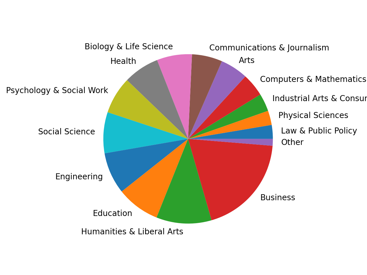
The "Other" category still makes up only a very small slice of the pie. That’s a good sign that merging those small categories was the right choice.
Zooming in on Categories
Sometimes you also want to verify whether a certain categorization makes sense. Are the members of a category more similar to one other than they are to the rest of the dataset? Again, a distribution is a good tool to get a first overview. Generally, we expect the distribution of a category to be similar to the normal distribution but have a smaller range.
Create a histogram plot showing the distribution of the median earnings for the engineering majors:
In [29]: df[df["Major_category"] == "Engineering"]["Median"].plot(kind="hist")
Out[29]: <AxesSubplot:ylabel='Frequency'>
You’ll get a histogram that you can compare to the histogram of all majors from the beginning:
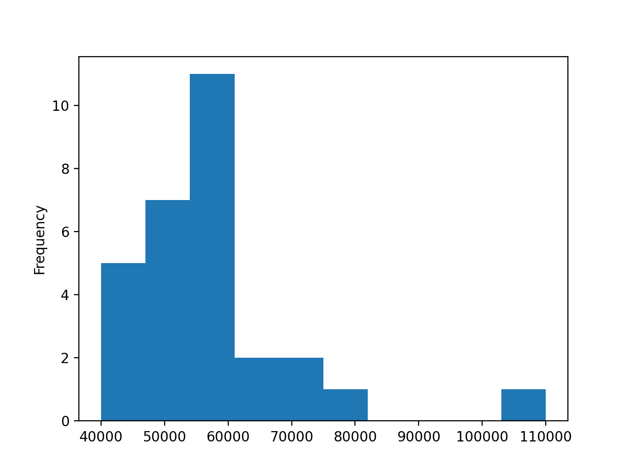
The range of the major median earnings is somewhat smaller, starting at $40,000. The distribution is closer to normal, although its peak is still on the left. So, even if you’ve decided to pick a major in the engineering category, it would be wise to dive deeper and analyze your options more thoroughly.
Conclusion
In this tutorial, you’ve learned how to start visualizing your dataset using Python and the pandas library. You’ve seen how some basic plots can give you insight into your data and guide your analysis.
In this tutorial, you learned how to:
- Get an overview of your dataset’s distribution with a histogram
- Discover correlation with a scatter plot
- Analyze categories with bar plots and their ratios with pie plots
- Determine which plot is most suited to your current task
Using .plot() and a small DataFrame, you’ve discovered quite a few possibilities for providing a picture of your data. You’re now ready to build on this knowledge and discover even more sophisticated visualizations.
If you have questions or comments, then please put them in the comments section below.
Further Reading
While pandas and Matplotlib make it pretty straightforward to visualize your data, there are endless possibilities for creating more sophisticated, beautiful, or engaging plots.
A great place to start is the plotting section of the pandas DataFrame documentation. It contains both a great overview and some detailed descriptions of the numerous parameters you can use with your DataFrames.
If you want to better understand the foundations of plotting with pandas, then get more acquainted with Matplotlib. While the documentation can be sometimes overwhelming, Anatomy of Matplotlib does an excellent job of introducing some advanced features.
If you want to impress your audience with interactive visualizations and encourage them to explore the data for themselves, then make Bokeh your next stop. You can find an overview of Bokeh’s features in Interactive Data Visualization in Python With Bokeh. You can also configure pandas to use Bokeh instead of Matplotlib with the pandas-bokeh library
If you want to create visualizations for statistical analysis or for a scientific paper, then check out Seaborn. You can find a short lesson about Seaborn in Python Histogram Plotting.
Watch Now This tutorial has a related video course created by the Real Python team. Watch it together with the written tutorial to deepen your understanding: Plot With pandas: Python Data Visualization Basics