Watch Now This tutorial has a related video course created by the Real Python team. Watch it together with the written tutorial to deepen your understanding: Interactive Data Visualization in Python With Bokeh
Bokeh prides itself on being a library for interactive data visualization.
Unlike popular counterparts in the Python visualization space, like Matplotlib and Seaborn, Bokeh renders its graphics using HTML and JavaScript. This makes it a great candidate for building web-based dashboards and applications. However, it’s an equally powerful tool for exploring and understanding your data or creating beautiful custom charts for a project or report.
Using a number of examples on a real-world dataset, the goal of this tutorial is to get you up and running with Bokeh.
You’ll learn how to:
- Transform your data into visualizations, using Bokeh
- Customize and organize your visualizations
- Add interactivity to your visualizations
So let’s jump in. You can download the examples and code snippets from the Real Python GitHub repo.
Free Download: Get a sample chapter from Python Tricks: The Book that shows you Python’s best practices with simple examples you can apply instantly to write more beautiful + Pythonic code.
From Data to Visualization
Building a visualization with Bokeh involves the following steps:
- Prepare the data
- Determine where the visualization will be rendered
- Set up the figure(s)
- Connect to and draw your data
- Organize the layout
- Preview and save your beautiful data creation
Let’s explore each step in more detail.
Prepare the Data
Any good data visualization starts with—you guessed it—data. If you need a quick refresher on handling data in Python, definitely check out the growing number of excellent Real Python tutorials on the subject.
This step commonly involves data handling libraries like Pandas and Numpy and is all about taking the required steps to transform it into a form that is best suited for your intended visualization.
Determine Where the Visualization Will Be Rendered
At this step, you’ll determine how you want to generate and ultimately view your visualization. In this tutorial, you’ll learn about two common options that Bokeh provides: generating a static HTML file and rendering your visualization inline in a Jupyter Notebook.
Set up the Figure(s)
From here, you’ll assemble your figure, preparing the canvas for your visualization. In this step, you can customize everything from the titles to the tick marks. You can also set up a suite of tools that can enable various user interactions with your visualization.
Connect to and Draw Your Data
Next, you’ll use Bokeh’s multitude of renderers to give shape to your data. Here, you have the flexibility to draw your data from scratch using the many available marker and shape options, all of which are easily customizable. This functionality gives you incredible creative freedom in representing your data.
Additionally, Bokeh has some built-in functionality for building things like stacked bar charts and plenty of examples for creating more advanced visualizations like network graphs and maps.
Organize the Layout
If you need more than one figure to express your data, Bokeh’s got you covered. Not only does Bokeh offer the standard grid-like layout options, but it also allows you to easily organize your visualizations into a tabbed layout in just a few lines of code.
In addition, your plots can be quickly linked together, so a selection on one will be reflected on any combination of the others.
Preview and Save Your Beautiful Data Creation
Finally, it’s time to see what you created.
Whether you’re viewing your visualization in a browser or notebook, you’ll be able to explore your visualization, examine your customizations, and play with any interactions that were added.
If you like what you see, you can save your visualization to an image file. Otherwise, you can revisit the steps above as needed to bring your data vision to reality.
That’s it! Those six steps are the building blocks for a tidy, flexible template that can be used to take your data from the table to the big screen:
"""Bokeh Visualization Template

This template is a general outline for turning your data into a
visualization using Bokeh.
"""
# Data handling
import pandas as pd
import numpy as np

# Bokeh libraries
from bokeh.io import output_file, output_notebook
from bokeh.plotting import figure, show
from bokeh.models import ColumnDataSource
from bokeh.layouts import row, column, gridplot
from bokeh.models.widgets import Tabs, Panel

# Prepare the data

# Determine where the visualization will be rendered
output_file('filename.html')  # Render to static HTML, or
output_notebook()  # Render inline in a Jupyter Notebook

# Set up the figure(s)
fig = figure()  # Instantiate a figure() object

# Connect to and draw the data

# Organize the layout

# Preview and save
show(fig)  # See what I made, and save if I like it
Some common code snippets that are found in each step are previewed above, and you’ll see how to fill out the rest as you move through the rest of the tutorial!
Generating Your First Figure
There are multiple ways to output your visualization in Bokeh. In this tutorial, you’ll see these two options:
output_file('filename.html')will write the visualization to a static HTML file.output_notebook()will render your visualization directly in a Jupyter Notebook.
It’s important to note that neither function will actually show you the visualization. That doesn’t happen until show() is called. However, they will ensure that, when show() is called, the visualization appears where you intend it to.
By calling both output_file() and output_notebook() in the same execution, the visualization will be rendered both to a static HTML file and inline in the notebook. However, if for whatever reason you run multiple output_file() commands in the same execution, only the last one will be used for rendering.
This is a great opportunity to give you your first glimpse at a default Bokeh figure() using output_file():
# Bokeh Libraries
from bokeh.io import output_file
from bokeh.plotting import figure, show

# The figure will be rendered in a static HTML file called output_file_test.html
output_file('output_file_test.html',
            title='Empty Bokeh Figure')

# Set up a generic figure() object
fig = figure()

# See what it looks like
show(fig)
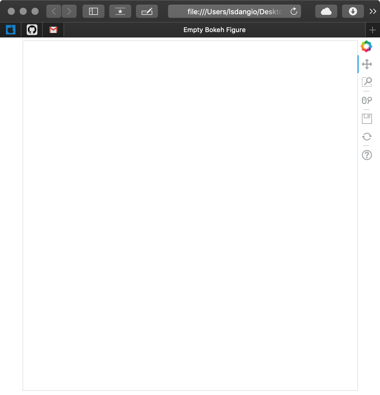
As you can see, a new browser window opened with a tab called Empty Bokeh Figure and an empty figure. Not shown is the file generated with the name output_file_test.html in your current working directory.
If you were to run the same code snippet with output_notebook() in place of output_file(), assuming you have a Jupyter Notebook fired up and ready to go, you will get the following:
# Bokeh Libraries
from bokeh.io import output_notebook
from bokeh.plotting import figure, show

# The figure will be right in my Jupyter Notebook
output_notebook()

# Set up a generic figure() object
fig = figure()

# See what it looks like
show(fig)
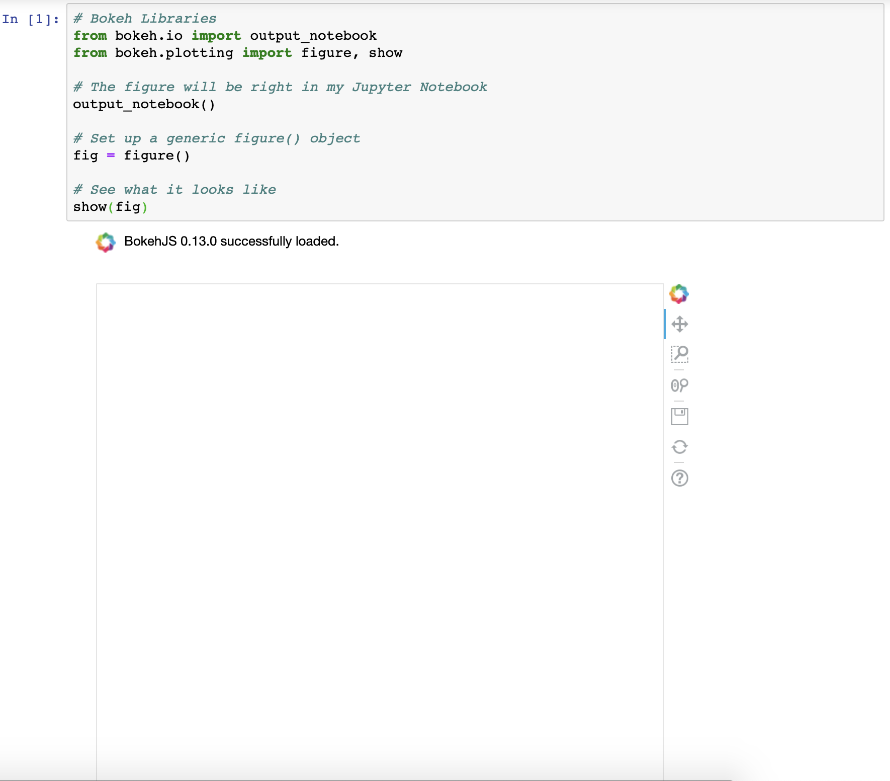
As you can see, the result is the same, just rendered in a different location.
More information about both output_file() and output_notebook() can be found in the Bokeh official docs.
Note: Sometimes, when rendering multiple visualizations sequentially, you’ll see that past renders are not being cleared with each execution. If you experience this, import and run the following between executions:
# Import reset_output (only needed once)
from bokeh.plotting import reset_output

# Use reset_output() between subsequent show() calls, as needed
reset_output()
Before moving on, you may have noticed that the default Bokeh figure comes pre-loaded with a toolbar. This is an important sneak preview into the interactive elements of Bokeh that come right out of the box. You’ll find out more about the toolbar and how to configure it in the Adding Interaction section at the end of this tutorial.
Getting Your Figure Ready for Data
Now that you know how to create and view a generic Bokeh figure either in a browser or Jupyter Notebook, it’s time to learn more about how to configure the figure() object.
The figure() object is not only the foundation of your data visualization but also the object that unlocks all of Bokeh’s available tools for visualizing data. The Bokeh figure is a subclass of the Bokeh Plot object, which provides many of the parameters that make it possible to configure the aesthetic elements of your figure.
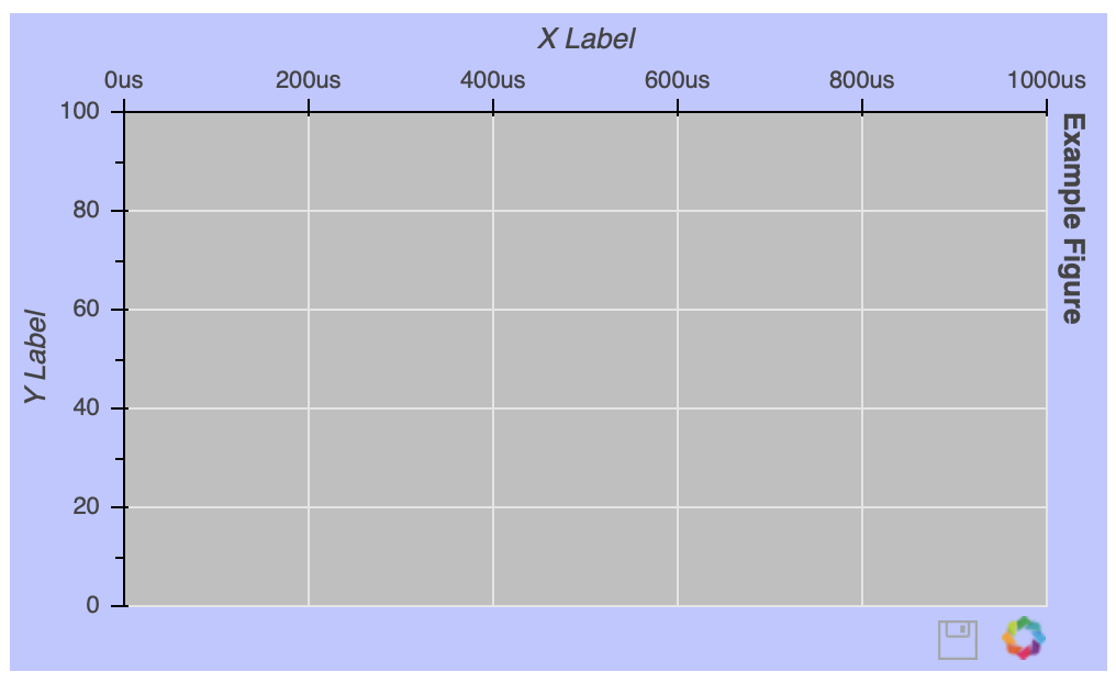
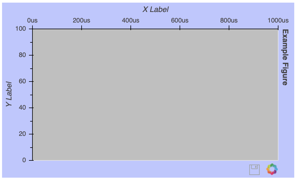
To show you just a glimpse into the customization options available, let’s create the ugliest figure ever:
# Bokeh Libraries
from bokeh.io import output_notebook
from bokeh.plotting import figure, show

# The figure will be rendered inline in my Jupyter Notebook
output_notebook()

# Example figure
fig = figure(background_fill_color='gray',
             background_fill_alpha=0.5,
             border_fill_color='blue',
             border_fill_alpha=0.25,
             plot_height=300,
             plot_width=500,
             h_symmetry=True,
             x_axis_label='X Label',
             x_axis_type='datetime',
             x_axis_location='above',
             x_range=('2018-01-01', '2018-06-30'),
             y_axis_label='Y Label',
             y_axis_type='linear',
             y_axis_location='left',
             y_range=(0, 100),
             title='Example Figure',
             title_location='right',
             toolbar_location='below',
             tools='save')

# See what it looks like
show(fig)
Once the figure() object is instantiated, you can still configure it after the fact. Let’s say you want to get rid of the gridlines:
# Remove the gridlines from the figure() object
fig.grid.grid_line_color = None

# See what it looks like
show(fig)
The gridline properties are accessible via the figure’s grid attribute. In this case, setting grid_line_color to None effectively removes the gridlines altogether. More details about figure attributes can be found below the fold in the Plot class documentation.
Note: If you’re working in a notebook or IDE with auto-complete functionality, this feature can definitely be your friend! With so many customizable elements, it can be very helpful in discovering the available options:
Otherwise, doing a quick web search, with the keyword bokeh and what you are trying to do, will generally point you in the right direction.
There is tons more I could touch on here, but don’t feel like you’re missing out. I’ll make sure to introduce different figure tweaks as the tutorial progresses. Here are some other helpful links on the topic:
- The Bokeh Plot Class is the superclass of the
figure()object, from which figures inherit a lot of their attributes. - The Figure Class documentation is a good place to find more detail about the arguments of the
figure()object.
Here are a few specific customization options worth checking out:
- Text Properties covers all the attributes related to changing font styles, sizes, colors, and so forth.
- TickFormatters are built-in objects specifically for formatting your axes using Python-like string formatting syntax.
Sometimes, it isn’t clear how your figure needs to be customized until it actually has some data visualized in it, so next you’ll learn how to make that happen.
Drawing Data With Glyphs
An empty figure isn’t all that exciting, so let’s look at glyphs: the building blocks of Bokeh visualizations. A glyph is a vectorized graphical shape or marker that is used to represent your data, like a circle or square. More examples can be found in the Bokeh gallery. After you create your figure, you are given access to a bevy of configurable glyph methods.
Let’s start with a very basic example, drawing some points on an x-y coordinate grid:
# Bokeh Libraries
from bokeh.io import output_file
from bokeh.plotting import figure, show

# My x-y coordinate data
x = [1, 2, 1]
y = [1, 1, 2]

# Output the visualization directly in the notebook
output_file('first_glyphs.html', title='First Glyphs')

# Create a figure with no toolbar and axis ranges of [0,3]
fig = figure(title='My Coordinates',
             plot_height=300, plot_width=300,
             x_range=(0, 3), y_range=(0, 3),
             toolbar_location=None)

# Draw the coordinates as circles
fig.circle(x=x, y=y,
           color='green', size=10, alpha=0.5)

# Show plot
show(fig)
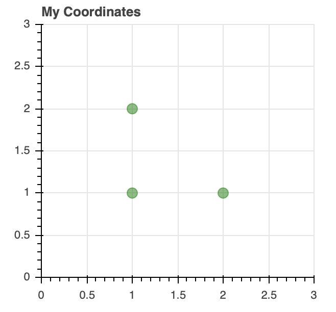
Once your figure is instantiated, you can see how it can be used to draw the x-y coordinate data using customized circle glyphs.
Here are a few categories of glyphs:
-
Marker includes shapes like circles, diamonds, squares, and triangles and is effective for creating visualizations like scatter and bubble charts.
-
Line covers things like single, step, and multi-line shapes that can be used to build line charts.
-
Bar/Rectangle shapes can be used to create traditional or stacked bar (
hbar) and column (vbar) charts as well as waterfall or gantt charts.
Information about the glyphs above, as well as others, can be found in Bokeh’s Reference Guide.
These glyphs can be combined as needed to fit your visualization needs. Let’s say I want to create a visualization that shows how many words I wrote per day to make this tutorial, with an overlaid trend line of the cumulative word count:
import numpy as np

# Bokeh libraries
from bokeh.io import output_notebook
from bokeh.plotting import figure, show

# My word count data
day_num = np.linspace(1, 10, 10)
daily_words = [450, 628, 488, 210, 287, 791, 508, 639, 397, 943]
cumulative_words = np.cumsum(daily_words)

# Output the visualization directly in the notebook
output_notebook()

# Create a figure with a datetime type x-axis
fig = figure(title='My Tutorial Progress',
             plot_height=400, plot_width=700,
             x_axis_label='Day Number', y_axis_label='Words Written',
             x_minor_ticks=2, y_range=(0, 6000),
             toolbar_location=None)

# The daily words will be represented as vertical bars (columns)
fig.vbar(x=day_num, bottom=0, top=daily_words,
         color='blue', width=0.75,
         legend='Daily')

# The cumulative sum will be a trend line
fig.line(x=day_num, y=cumulative_words,
         color='gray', line_width=1,
         legend='Cumulative')

# Put the legend in the upper left corner
fig.legend.location = 'top_left'

# Let's check it out
show(fig)
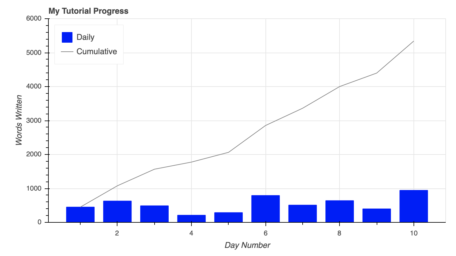
To combine the columns and lines on the figure, they are simply created using the same figure() object.
Additionally, you can see above how seamlessly a legend can be created by setting the legend property for each glyph. The legend was then moved to the upper left corner of the plot by assigning 'top_left' to fig.legend.location.
You can check out much more info about styling legends. Teaser: they will show up again later in the tutorial when we start digging into interactive elements of the visualization.
A Quick Aside About Data
Anytime you are exploring a new visualization library, it’s a good idea to start with some data in a domain you are familiar with. The beauty of Bokeh is that nearly any idea you have should be possible. It’s just a matter of how you want to leverage the available tools to do so.
The remaining examples will use publicly available data from Kaggle, which has information about the National Basketball Association’s (NBA) 2017-18 season, specifically:
- 2017-18_playerBoxScore.csv: game-by-game snapshots of player statistics
- 2017-18_teamBoxScore.csv: game-by-game snapshots of team statistics
- 2017-18_standings.csv: daily team standings and rankings
This data has nothing to do with what I do for work, but I love basketball and enjoy thinking about ways to visualize the ever-growing amount of data associated with it.
If you don’t have data to play with from school or work, think about something you’re interested in and try to find some data related to that. It will go a long way in making both the learning and the creative process faster and more enjoyable!
To follow along with the examples in the tutorial, you can download the datasets from the links above and read them into a Pandas DataFrame using the following commands:
import pandas as pd

# Read the csv files
player_stats = pd.read_csv('2017-18_playerBoxScore.csv', parse_dates=['gmDate'])
team_stats = pd.read_csv('2017-18_teamBoxScore.csv', parse_dates=['gmDate'])
standings = pd.read_csv('2017-18_standings.csv', parse_dates=['stDate'])
This code snippet reads the data from the three CSV files and automatically interprets the date columns as datetime objects.
It’s now time to get your hands on some real data.
Using the ColumnDataSource Object
The examples above used Python lists and Numpy arrays to represent the data, and Bokeh is well equipped to handle these datatypes. However, when it comes to data in Python, you are most likely going to come across Python dictionaries and Pandas DataFrames, especially if you’re reading in data from a file or external data source.
Bokeh is well equipped to work with these more complex data structures and even has built-in functionality to handle them, namely the ColumnDataSource.
You may be asking yourself, “Why use a ColumnDataSource when Bokeh can interface with other data types directly?”
For one, whether you reference a list, array, dictionary, or DataFrame directly, Bokeh is going to turn it into a ColumnDataSource behind the scenes anyway. More importantly, the ColumnDataSource makes it much easier to implement Bokeh’s interactive affordances.
The ColumnDataSource is foundational in passing the data to the glyphs you are using to visualize. Its primary functionality is to map names to the columns of your data. This makes it easier for you to reference elements of your data when building your visualization. It also makes it easier for Bokeh to do the same when building your visualization.
The ColumnDataSource can interpret three types of data objects:
-
Python
dict: The keys are names associated with the respective value sequences (lists, arrays, and so forth). -
Pandas
DataFrame: The columns of theDataFramebecome the reference names for theColumnDataSource. -
Pandas
groupby: The columns of theColumnDataSourcereference the columns as seen by callinggroupby.describe().
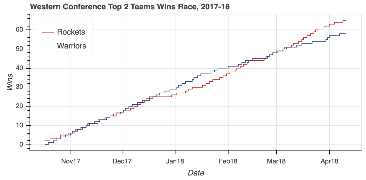
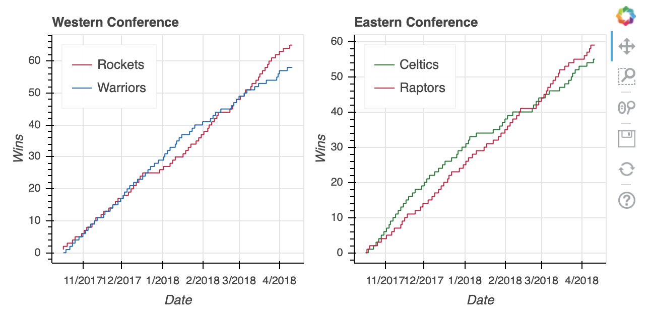
Let’s start by visualizing the race for first place in the NBA’s Western Conference in 2017-18 between the defending champion Golden State Warriors and the challenger Houston Rockets. The daily win-loss records of these two teams is stored in a DataFrame named west_top_2:
>>> west_top_2 = (standings[(standings['teamAbbr'] == 'HOU') | (standings['teamAbbr'] == 'GS')]
...               .loc[:, ['stDate', 'teamAbbr', 'gameWon']]
...               .sort_values(['teamAbbr','stDate']))
>>> west_top_2.head()
        stDate teamAbbr  gameWon
9   2017-10-17       GS        0
39  2017-10-18       GS        0
69  2017-10-19       GS        0
99  2017-10-20       GS        1
129 2017-10-21       GS        1
From here, you can load this DataFrame into two ColumnDataSource objects and visualize the race:
# Bokeh libraries
from bokeh.plotting import figure, show
from bokeh.io import output_file
from bokeh.models import ColumnDataSource

# Output to file
output_file('west-top-2-standings-race.html',
            title='Western Conference Top 2 Teams Wins Race')

# Isolate the data for the Rockets and Warriors
rockets_data = west_top_2[west_top_2['teamAbbr'] == 'HOU']
warriors_data = west_top_2[west_top_2['teamAbbr'] == 'GS']

# Create a ColumnDataSource object for each team
rockets_cds = ColumnDataSource(rockets_data)
warriors_cds = ColumnDataSource(warriors_data)

# Create and configure the figure
fig = figure(x_axis_type='datetime',
             plot_height=300, plot_width=600,
             title='Western Conference Top 2 Teams Wins Race, 2017-18',
             x_axis_label='Date', y_axis_label='Wins',
             toolbar_location=None)

# Render the race as step lines
fig.step('stDate', 'gameWon',
         color='#CE1141', legend='Rockets',
         source=rockets_cds)
fig.step('stDate', 'gameWon',
         color='#006BB6', legend='Warriors',
         source=warriors_cds)

# Move the legend to the upper left corner
fig.legend.location = 'top_left'

# Show the plot
show(fig)
Notice how the respective ColumnDataSource objects are referenced when creating the two lines. You simply pass the original column names as input parameters and specify which ColumnDataSource to use via the source property.
The visualization shows the tight race throughout the season, with the Warriors building a pretty big cushion around the middle of the season. However, a bit of a late-season slide allowed the Rockets to catch up and ultimately surpass the defending champs to finish the season as the Western Conference number-one seed.
Note: In Bokeh, you can specify colors either by name, hex value, or RGB color code.
For the visualization above, a color is being specified for the respective lines representing the two teams. Instead of using CSS color names like 'red' for the Rockets and 'blue' for the Warriors, you might have wanted to add a nice visual touch by using the official team colors in the form of hex color codes. Alternatively, you could have used tuples representing RGB color codes: (206, 17, 65) for the Rockets, (0, 107, 182) for the Warriors.
Bokeh provides a helpful list of CSS color names categorized by their general hue. Also, htmlcolorcodes.com is a great site for finding CSS, hex, and RGB color codes.
ColumnDataSource objects can do more than just serve as an easy way to reference DataFrame columns. The ColumnDataSource object has three built-in filters that can be used to create views on your data using a CDSView object:
GroupFilterselects rows from aColumnDataSourcebased on a categorical reference valueIndexFilterfilters theColumnDataSourcevia a list of integer indicesBooleanFilterallows you to use a list ofbooleanvalues, withTruerows being selected
In the previous example, two ColumnDataSource objects were created, one each from a subset of the west_top_2 DataFrame. The next example will recreate the same output from one ColumnDataSource based on all of west_top_2 using a GroupFilter that creates a view on the data:
# Bokeh libraries
from bokeh.plotting import figure, show
from bokeh.io import output_file
from bokeh.models import ColumnDataSource, CDSView, GroupFilter

# Output to file
output_file('west-top-2-standings-race.html',
            title='Western Conference Top 2 Teams Wins Race')

# Create a ColumnDataSource
west_cds = ColumnDataSource(west_top_2)

# Create views for each team
rockets_view = CDSView(source=west_cds,
                       filters=[GroupFilter(column_name='teamAbbr', group='HOU')])
warriors_view = CDSView(source=west_cds,
                        filters=[GroupFilter(column_name='teamAbbr', group='GS')])

# Create and configure the figure
west_fig = figure(x_axis_type='datetime',
                  plot_height=300, plot_width=600,
                  title='Western Conference Top 2 Teams Wins Race, 2017-18',
                  x_axis_label='Date', y_axis_label='Wins',
                  toolbar_location=None)

# Render the race as step lines
west_fig.step('stDate', 'gameWon',
              source=west_cds, view=rockets_view,
              color='#CE1141', legend='Rockets')
west_fig.step('stDate', 'gameWon',
              source=west_cds, view=warriors_view,
              color='#006BB6', legend='Warriors')

# Move the legend to the upper left corner
west_fig.legend.location = 'top_left'

# Show the plot
show(west_fig)
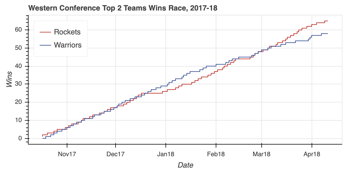
Notice how the GroupFilter is passed to CDSView in a list. This allows you to combine multiple filters together to isolate the data you need from the ColumnDataSource as needed.
For information about integrating data sources, check out the Bokeh user guide’s post on the ColumnDataSource and other source objects available.
The Western Conference ended up being an exciting race, but say you want to see if the Eastern Conference was just as tight. Not only that, but you’d like to view them in a single visualization. This is a perfect segue to the next topic: layouts.
Organizing Multiple Visualizations With Layouts
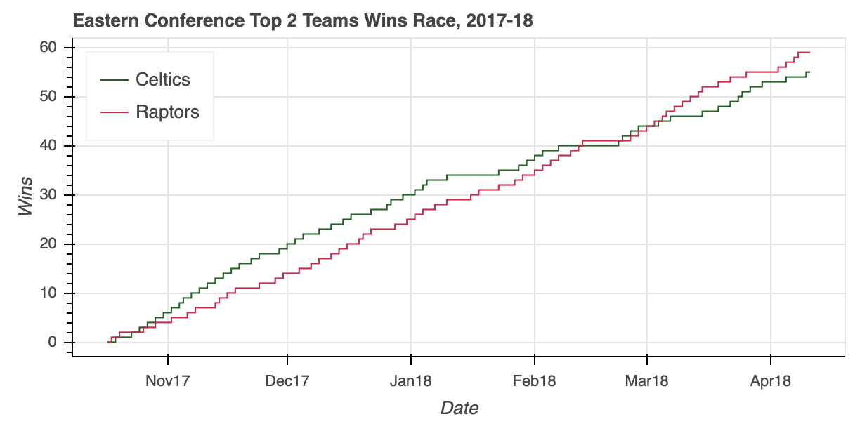
The Eastern Conference standings came down to two rivals in the Atlantic Division: the Boston Celtics and the Toronto Raptors. Before replicating the steps used to create west_top_2, let’s try to put the ColumnDataSource to the test one more time using what you learned above.
In this example, you’ll see how to feed an entire DataFrame into a ColumnDataSource and create views to isolate the relevant data:
# Bokeh libraries
from bokeh.plotting import figure, show
from bokeh.io import output_file
from bokeh.models import ColumnDataSource, CDSView, GroupFilter

# Output to file
output_file('east-top-2-standings-race.html',
            title='Eastern Conference Top 2 Teams Wins Race')

# Create a ColumnDataSource
standings_cds = ColumnDataSource(standings)

# Create views for each team
celtics_view = CDSView(source=standings_cds,
                      filters=[GroupFilter(column_name='teamAbbr',
                                           group='BOS')])
raptors_view = CDSView(source=standings_cds,
                      filters=[GroupFilter(column_name='teamAbbr',
                                           group='TOR')])

# Create and configure the figure
east_fig = figure(x_axis_type='datetime',
           plot_height=300, plot_width=600,
           title='Eastern Conference Top 2 Teams Wins Race, 2017-18',
           x_axis_label='Date', y_axis_label='Wins',
           toolbar_location=None)

# Render the race as step lines
east_fig.step('stDate', 'gameWon',
              color='#007A33', legend='Celtics',
              source=standings_cds, view=celtics_view)
east_fig.step('stDate', 'gameWon',
              color='#CE1141', legend='Raptors',
              source=standings_cds, view=raptors_view)

# Move the legend to the upper left corner
east_fig.legend.location = 'top_left'

# Show the plot
show(east_fig)
The ColumnDataSource was able to isolate the relevant data within a 5,040-by-39 DataFrame without breaking a sweat, saving a few lines of Pandas code in the process.
Looking at the visualization, you can see that the Eastern Conference race was no slouch. After the Celtics roared out of the gate, the Raptors clawed all the way back to overtake their division rival and finish the regular season with five more wins.
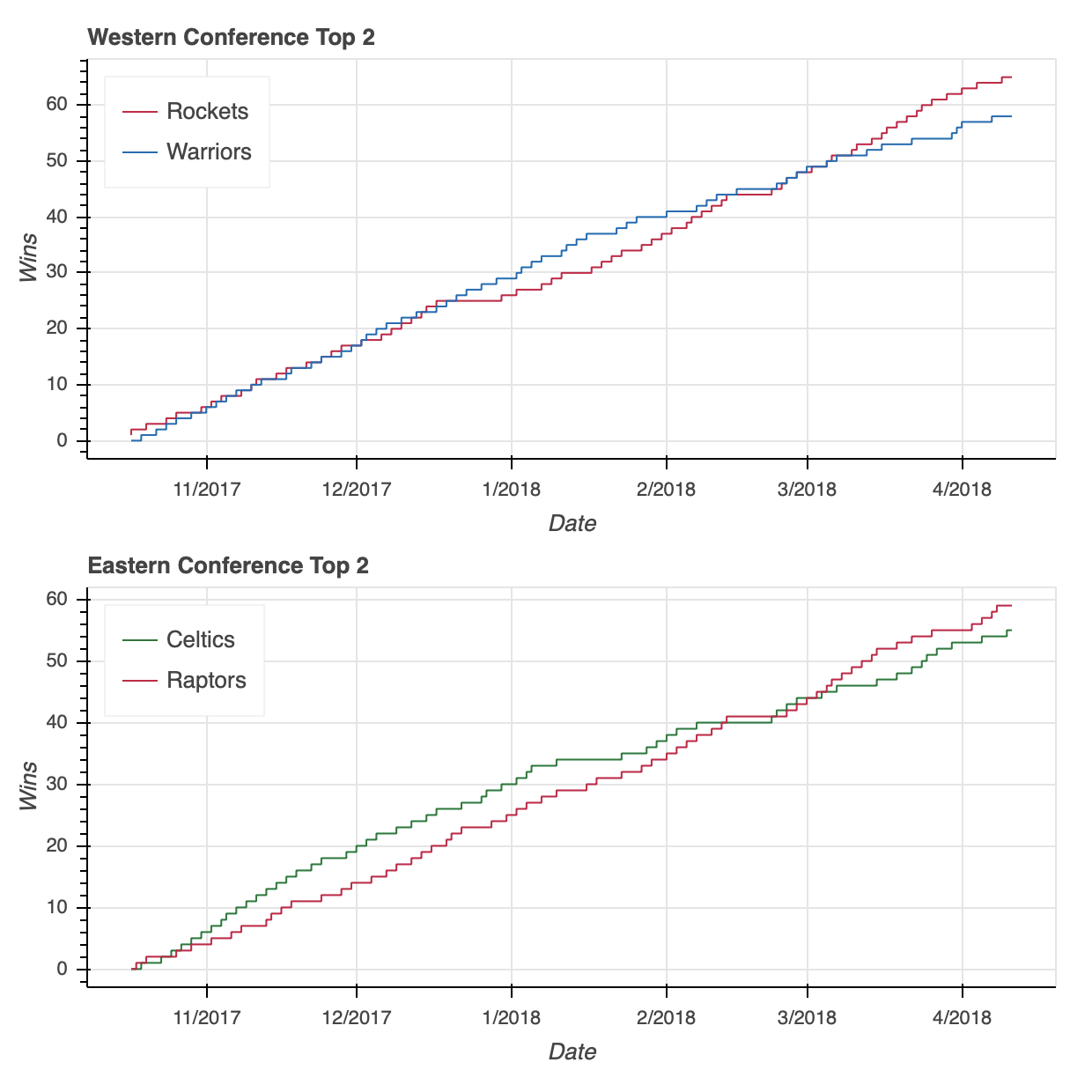
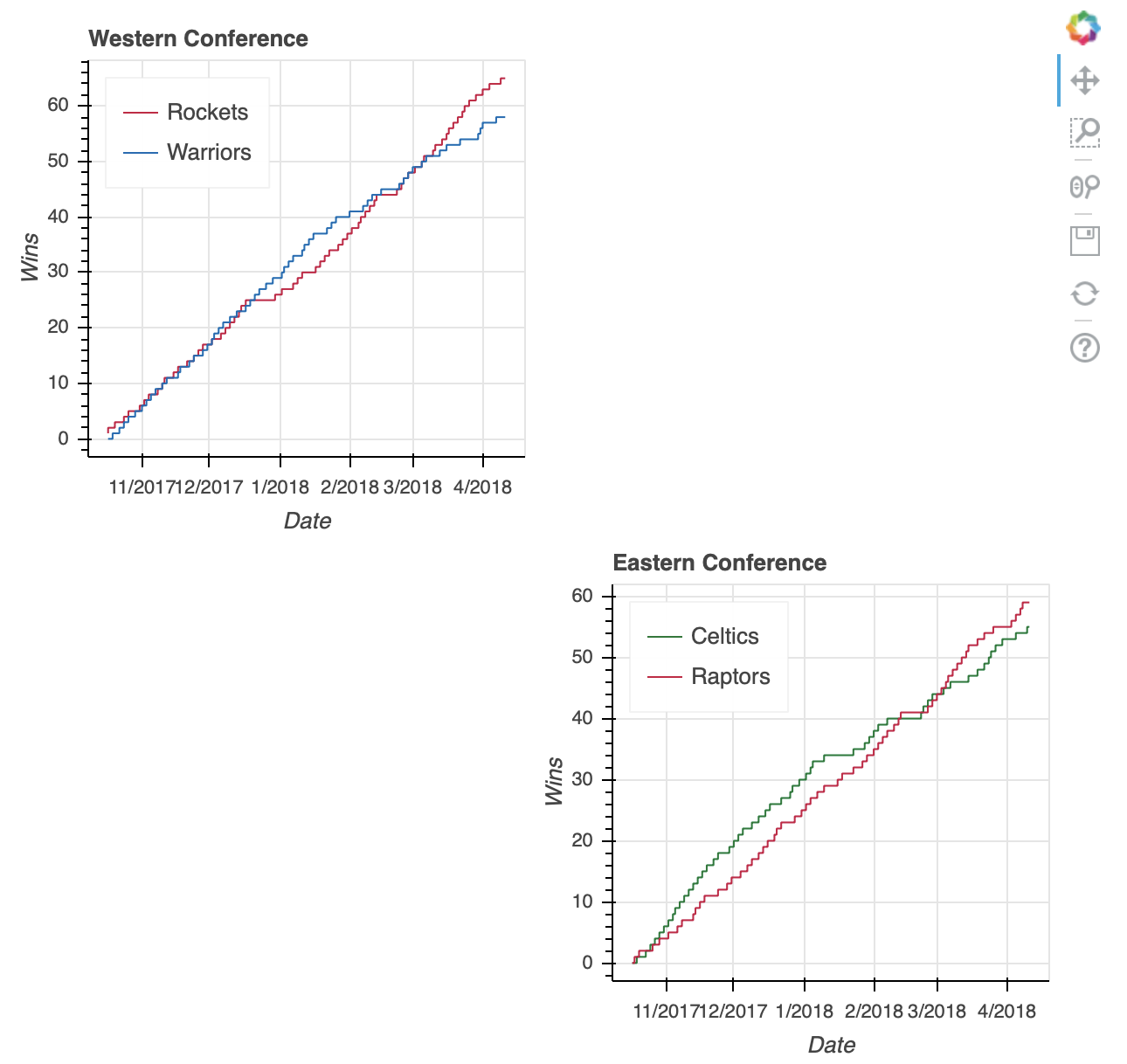
With our two visualizations ready, it’s time to put them together.
Similar to the functionality of Matplotlib’s subplot, Bokeh offers the column, row, and gridplot functions in its bokeh.layouts module. These functions can more generally be classified as layouts.
The usage is very straightforward. If you want to put two visualizations in a vertical configuration, you can do so with the following:
# Bokeh library
from bokeh.plotting import figure, show
from bokeh.io import output_file
from bokeh.layouts import column

# Output to file
output_file('east-west-top-2-standings-race.html',
            title='Conference Top 2 Teams Wins Race')

# Plot the two visualizations in a vertical configuration
show(column(west_fig, east_fig))
I’ll save you the two lines of code, but rest assured that swapping column for row in the snippet above will similarly configure the two plots in a horizontal configuration.
Note: If you’re trying out the code snippets as you go through the tutorial, I want to take a quick detour to address an error you may see accessing west_fig and east_fig in the following examples. In doing so, you may receive an error like this:
WARNING:bokeh.core.validation.check:W-1004 (BOTH_CHILD_AND_ROOT): Models should not be a document root...
This is one of many errors that are part of Bokeh’s validation module, where w-1004 in particular is warning about the re-use of west_fig and east_fig in a new layout.
To avoid this error as you test the examples, preface the code snippet illustrating each layout with the following:
# Bokeh libraries
from bokeh.plotting import figure, show
from bokeh.models import ColumnDataSource, CDSView, GroupFilter

# Create a ColumnDataSource
standings_cds = ColumnDataSource(standings)

# Create the views for each team
celtics_view = CDSView(source=standings_cds,
                      filters=[GroupFilter(column_name='teamAbbr',
                                           group='BOS')])

raptors_view = CDSView(source=standings_cds,
                      filters=[GroupFilter(column_name='teamAbbr',
                                           group='TOR')])

rockets_view = CDSView(source=standings_cds,
                      filters=[GroupFilter(column_name='teamAbbr',
                                           group='HOU')])
warriors_view = CDSView(source=standings_cds,
                      filters=[GroupFilter(column_name='teamAbbr',
                                           group='GS')])

# Create and configure the figure
east_fig = figure(x_axis_type='datetime',
                  plot_height=300,
                  x_axis_label='Date',
                  y_axis_label='Wins',
                  toolbar_location=None)

west_fig = figure(x_axis_type='datetime',
                  plot_height=300,
                  x_axis_label='Date',
                  y_axis_label='Wins',
                  toolbar_location=None)

# Configure the figures for each conference
east_fig.step('stDate', 'gameWon',
              color='#007A33', legend='Celtics',
              source=standings_cds, view=celtics_view)
east_fig.step('stDate', 'gameWon',
              color='#CE1141', legend='Raptors',
              source=standings_cds, view=raptors_view)

west_fig.step('stDate', 'gameWon', color='#CE1141', legend='Rockets',
              source=standings_cds, view=rockets_view)
west_fig.step('stDate', 'gameWon', color='#006BB6', legend='Warriors',
              source=standings_cds, view=warriors_view)

# Move the legend to the upper left corner
east_fig.legend.location = 'top_left'
west_fig.legend.location = 'top_left'

# Layout code snippet goes here!
Doing so will renew the relevant components to render the visualization, ensuring that no warning is needed.
Instead of using column or row, you may want to use a gridplot instead.
One key difference of gridplot is that it will automatically consolidate the toolbar across all of its children figures. The two visualizations above do not have a toolbar, but if they did, then each figure would have its own when using column or row. With that, it also has its own toolbar_location property, seen below set to 'right'.
Syntactically, you’ll also notice below that gridplot differs in that, instead of being passed a tuple as input, it requires a list of lists, where each sub-list represents a row in the grid:
# Bokeh libraries
from bokeh.io import output_file
from bokeh.layouts import gridplot

# Output to file
output_file('east-west-top-2-gridplot.html',
            title='Conference Top 2 Teams Wins Race')

# Reduce the width of both figures
east_fig.plot_width = west_fig.plot_width = 300

# Edit the titles
east_fig.title.text = 'Eastern Conference'
west_fig.title.text = 'Western Conference'

# Configure the gridplot
east_west_gridplot = gridplot([[west_fig, east_fig]],
                              toolbar_location='right')

# Plot the two visualizations in a horizontal configuration
show(east_west_gridplot)
Lastly, gridplot allows the passing of None values, which are interpreted as blank subplots. Therefore, if you wanted to leave a placeholder for two additional plots, then you could do something like this:
# Bokeh libraries
from bokeh.io import output_file
from bokeh.layouts import gridplot

# Output to file
output_file('east-west-top-2-gridplot.html',
            title='Conference Top 2 Teams Wins Race')

# Reduce the width of both figures
east_fig.plot_width = west_fig.plot_width = 300

# Edit the titles
east_fig.title.text = 'Eastern Conference'
west_fig.title.text = 'Western Conference'

# Plot the two visualizations with placeholders
east_west_gridplot = gridplot([[west_fig, None], [None, east_fig]],
                              toolbar_location='right')

# Plot the two visualizations in a horizontal configuration
show(east_west_gridplot)
If you’d rather toggle between both visualizations at their full size without having to squash them down to fit next to or on top of each other, a good option is a tabbed layout.
A tabbed layout consists of two Bokeh widget functions: Tab() and Panel() from the bokeh.models.widgets sub-module. Like using gridplot(), making a tabbed layout is pretty straightforward:
# Bokeh Library
from bokeh.io import output_file
from bokeh.models.widgets import Tabs, Panel

# Output to file
output_file('east-west-top-2-tabbed_layout.html',
            title='Conference Top 2 Teams Wins Race')

# Increase the plot widths
east_fig.plot_width = west_fig.plot_width = 800

# Create two panels, one for each conference
east_panel = Panel(child=east_fig, title='Eastern Conference')
west_panel = Panel(child=west_fig, title='Western Conference')

# Assign the panels to Tabs
tabs = Tabs(tabs=[west_panel, east_panel])

# Show the tabbed layout
show(tabs)
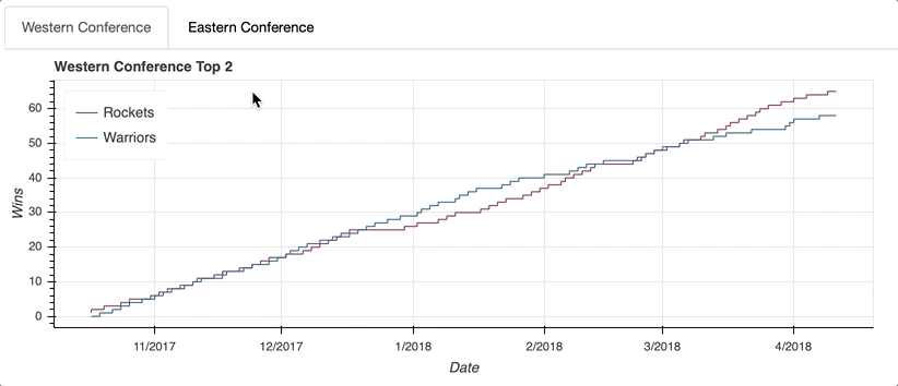
The first step is to create a Panel() for each tab. That may sound a little confusing, but think of the Tabs() function as the mechanism that organizes the individual tabs created with Panel().
Each Panel() takes as input a child, which can either be a single figure() or a layout. (Remember that a layout is a general name for a column, row, or gridplot.) Once your panels are assembled, they can be passed as input to Tabs() in a list.
Now that you understand how to access, draw, and organize your data, it’s time to move on to the real magic of Bokeh: interaction! As always, check out Bokeh’s User Guide for more information on layouts.
Adding Interaction
The feature that sets Bokeh apart is its ability to easily implement interactivity in your visualization. Bokeh even goes as far as describing itself as an interactive visualization library:
Bokeh is an interactive visualization library that targets modern web browsers for presentation. (Source)
In this section, we’ll touch on five ways that you can add interactivity:
- Configuring the toolbar
- Selecting data points
- Adding hover actions
- Linking axes and selections
- Highlighting data using the legend
Implementing these interactive elements open up possibilities for exploring your data that static visualizations just can’t do by themselves.
Configuring the Toolbar
As you saw all the way back in Generating Your First Figure, the default Bokeh figure() comes with a toolbar right out of the box. The default toolbar comes with the following tools (from left to right):
- Pan
- Box Zoom
- Wheel Zoom
- Save
- Reset
- A link to Bokeh’s user guide for Configuring Plot Tools
- A link to the Bokeh homepage
The toolbar can be removed by passing toolbar_location=None when instantiating a figure() object, or relocated by passing any of 'above', 'below', 'left', or 'right'.
Additionally, the toolbar can be configured to include any combination of tools you desire. Bokeh offers 18 specific tools across five categories:
- Pan/Drag:
box_select,box_zoom,lasso_select,pan,xpan,ypan,resize_select - Click/Tap:
poly_select,tap - Scroll/Pinch:
wheel_zoom,xwheel_zoom,ywheel_zoom - Actions:
undo,redo,reset,save - Inspectors:
crosshair,hover
To geek out on tools , make sure to visit Specifying Tools. Otherwise, they’ll be illustrated in covering the various interactions covered herein.
Selecting Data Points
Implementing selection behavior is as easy as adding a few specific keywords when declaring your glyphs.
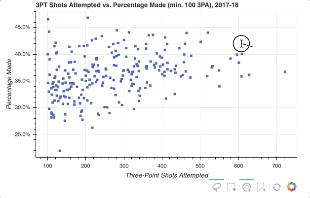
The next example will create a scatter plot that relates a player’s total number of three-point shot attempts to the percentage made (for players with at least 100 three-point shot attempts).
The data can be aggregated from the player_stats DataFrame:
# Find players who took at least 1 three-point shot during the season
three_takers = player_stats[player_stats['play3PA'] > 0]

# Clean up the player names, placing them in a single column
three_takers['name'] = [f'{p["playFNm"]} {p["playLNm"]}'
                        for _, p in three_takers.iterrows()]

# Aggregate the total three-point attempts and makes for each player
three_takers = (three_takers.groupby('name')
                            .sum()
                            .loc[:,['play3PA', 'play3PM']]
                            .sort_values('play3PA', ascending=False))

# Filter out anyone who didn't take at least 100 three-point shots
three_takers = three_takers[three_takers['play3PA'] >= 100].reset_index()

# Add a column with a calculated three-point percentage (made/attempted)
three_takers['pct3PM'] = three_takers['play3PM'] / three_takers['play3PA']
Here’s a sample of the resulting DataFrame:
>>> three_takers.sample(5)
                   name  play3PA  play3PM    pct3PM
229        Corey Brewer      110       31  0.281818
78           Marc Gasol      320      109  0.340625
126      Raymond Felton      230       81  0.352174
127  Kristaps Porziņģis      229       90  0.393013
66      Josh Richardson      336      127  0.377976
Let’s say you want to select a groups of players in the distribution, and in doing so mute the color of the glyphs representing the non-selected players:
# Bokeh Libraries
from bokeh.plotting import figure, show
from bokeh.io import output_file
from bokeh.models import ColumnDataSource, NumeralTickFormatter

# Output to file
output_file('three-point-att-vs-pct.html',
            title='Three-Point Attempts vs. Percentage')

# Store the data in a ColumnDataSource
three_takers_cds = ColumnDataSource(three_takers)

# Specify the selection tools to be made available
select_tools = ['box_select', 'lasso_select', 'poly_select', 'tap', 'reset']

# Create the figure
fig = figure(plot_height=400,
             plot_width=600,
             x_axis_label='Three-Point Shots Attempted',
             y_axis_label='Percentage Made',
             title='3PT Shots Attempted vs. Percentage Made (min. 100 3PA), 2017-18',
             toolbar_location='below',
             tools=select_tools)

# Format the y-axis tick labels as percentages
fig.yaxis[0].formatter = NumeralTickFormatter(format='00.0%')

# Add square representing each player
fig.square(x='play3PA',
           y='pct3PM',
           source=three_takers_cds,
           color='royalblue',
           selection_color='deepskyblue',
           nonselection_color='lightgray',
           nonselection_alpha=0.3)

# Visualize
show(fig)
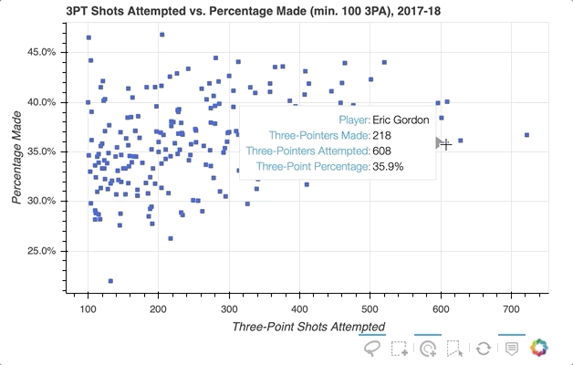
First, specify the selection tools you want to make available. In the example above, 'box_select', 'lasso_select', 'poly_select', and 'tap' (plus a reset button) were specified in a list called select_tools. When the figure is instantiated, the toolbar is positioned 'below' the plot, and the list is passed to tools to make the tools selected above available.
Each player is initially represented by a royal blue square glyph, but the following configurations are set for when a player or group of players is selected:
- Turn the selected player(s) to
deepskyblue - Change all non-selected players’ glyphs to a
lightgraycolor with0.3opacity
That’s it! With just a few quick additions, the visualization now looks like this:
For even more information about what you can do upon selection, check out Selected and Unselected Glyphs.
Adding Hover Actions
So the ability to select specific player data points that seem of interest in my scatter plot is implemented, but what if you want to quickly see what individual players a glyph represents? One option is to use Bokeh’s HoverTool() to show a tooltip when the cursor crosses paths with a glyph. All you need to do is append the following to the code snippet above:
# Bokeh Library
from bokeh.models import HoverTool

# Format the tooltip
tooltips = [
            ('Player','@name'),
            ('Three-Pointers Made', '@play3PM'),
            ('Three-Pointers Attempted', '@play3PA'),
            ('Three-Point Percentage','@pct3PM{00.0%}'),
           ]

# Add the HoverTool to the figure
fig.add_tools(HoverTool(tooltips=tooltips))

# Visualize
show(fig)
The HoverTool() is slightly different than the selection tools you saw above in that it has properties, specifically tooltips.
First, you can configure a formatted tooltip by creating a list of tuples containing a description and reference to the ColumnDataSource. This list was passed as input to the HoverTool() and then simply added to the figure using add_tools(). Here’s what happened:
Notice the addition of the Hover button to the toolbar, which can be toggled on and off.
If you want to even further emphasize the players on hover, Bokeh makes that possible with hover inspections. Here is a slightly modified version of the code snippet that added the tooltip:
# Format the tooltip
tooltips = [
            ('Player','@name'),
            ('Three-Pointers Made', '@play3PM'),
            ('Three-Pointers Attempted', '@play3PA'),
            ('Three-Point Percentage','@pct3PM{00.0%}'),
           ]

# Configure a renderer to be used upon hover
hover_glyph = fig.circle(x='play3PA', y='pct3PM', source=three_takers_cds,
                         size=15, alpha=0,
                         hover_fill_color='black', hover_alpha=0.5)

# Add the HoverTool to the figure
fig.add_tools(HoverTool(tooltips=tooltips, renderers=[hover_glyph]))

# Visualize
show(fig)
This is done by creating a completely new glyph, in this case circles instead of squares, and assigning it to hover_glyph. Note that the initial opacity is set to zero so that it is invisible until the cursor is touching it. The properties that appear upon hover are captured by setting hover_alpha to 0.5 along with the hover_fill_color.
Now you will see a small black circle appear over the original square when hovering over the various markers:
To further explore the capabilities of the HoverTool(), see the HoverTool and Hover Inspections guides.
Linking Axes and Selections
Linking is the process of syncing elements of different visualizations within a layout. For instance, maybe you want to link the axes of multiple plots to ensure that if you zoom in on one it is reflected on another. Let’s see how it is done.
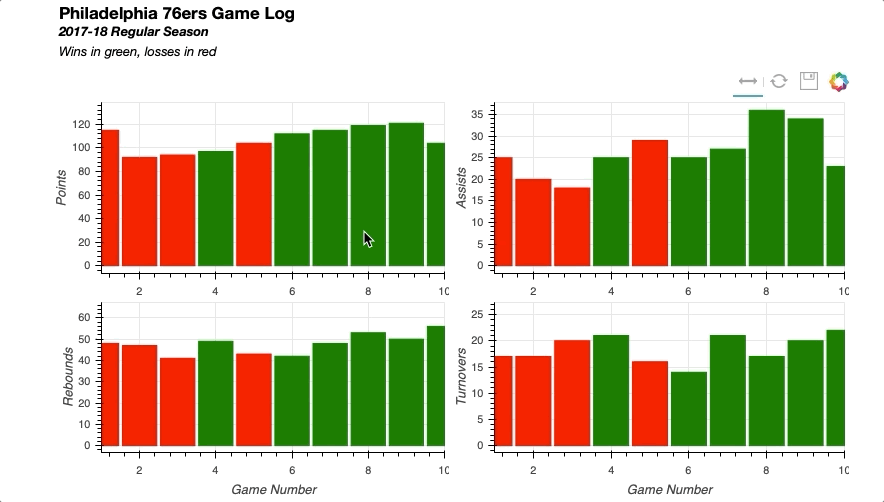
For this example, the visualization will be able to pan to different segments of a team’s schedule and examine various game stats. Each stat will be represented by its own plot in a two-by-two gridplot() .
The data can be collected from the team_stats DataFrame, selecting the Philadelphia 76ers as the team of interest:
# Isolate relevant data
phi_gm_stats = (team_stats[(team_stats['teamAbbr'] == 'PHI') &
                           (team_stats['seasTyp'] == 'Regular')]
                .loc[:, ['gmDate',
                         'teamPTS',
                         'teamTRB',
                         'teamAST',
                         'teamTO',
                         'opptPTS',]]
                .sort_values('gmDate'))

# Add game number
phi_gm_stats['game_num'] = range(1, len(phi_gm_stats)+1)

# Derive a win_loss column
win_loss = []
for _, row in phi_gm_stats.iterrows():

    # If the 76ers score more points, it's a win
    if row['teamPTS'] > row['opptPTS']:
        win_loss.append('W')
    else:
        win_loss.append('L')

# Add the win_loss data to the DataFrame
phi_gm_stats['winLoss'] = win_loss
Here are the results of the 76ers’ first 5 games:
>>> phi_gm_stats.head()
        gmDate  teamPTS  teamTRB  teamAST  teamTO  opptPTS  game_num winLoss
10  2017-10-18      115       48       25      17      120         1       L
39  2017-10-20       92       47       20      17      102         2       L
52  2017-10-21       94       41       18      20      128         3       L
80  2017-10-23       97       49       25      21       86         4       W
113 2017-10-25      104       43       29      16      105         5       L
Start by importing the necessary Bokeh libraries, specifying the output parameters, and reading the data into a ColumnDataSource:
# Bokeh Libraries
from bokeh.plotting import figure, show
from bokeh.io import output_file
from bokeh.models import ColumnDataSource, CategoricalColorMapper, Div
from bokeh.layouts import gridplot, column

# Output to file
output_file('phi-gm-linked-stats.html',
                title='76ers Game Log')

# Store the data in a ColumnDataSource
gm_stats_cds = ColumnDataSource(phi_gm_stats)
Each game is represented by a column, and will be colored green if the result was a win and red for a loss. To accomplish this, Bokeh’s CategoricalColorMapper can be used to map the data values to specified colors:
# Create a CategoricalColorMapper that assigns a color to wins and losses
win_loss_mapper = CategoricalColorMapper(factors = ['W', 'L'],
                                         palette=['green', 'red'])
For this use case, a list specifying the categorical data values to be mapped is passed to factors and a list with the intended colors to palette. For more on the CategoricalColorMapper, see the Colors section of Handling Categorical Data on Bokeh’s User Guide.
There are four stats to visualize in the two-by-two gridplot: points, assists, rebounds, and turnovers. In creating the four figures and configuring their respective charts, there is a lot of redundancy in the properties. So to streamline the code a for loop can be used:
# Create a dict with the stat name and its corresponding column in the data
stat_names = {'Points': 'teamPTS',
              'Assists': 'teamAST',
              'Rebounds': 'teamTRB',
              'Turnovers': 'teamTO',}

# The figure for each stat will be held in this dict
stat_figs = {}

# For each stat in the dict
for stat_label, stat_col in stat_names.items():

    # Create a figure
    fig = figure(y_axis_label=stat_label,
                 plot_height=200, plot_width=400,
                 x_range=(1, 10), tools=['xpan', 'reset', 'save'])

    # Configure vbar
    fig.vbar(x='game_num', top=stat_col, source=gm_stats_cds, width=0.9,
             color=dict(field='winLoss', transform=win_loss_mapper))

    # Add the figure to stat_figs dict
    stat_figs[stat_label] = fig
As you can see, the only parameters that needed to be adjusted were the y-axis-label of the figure and the data that will dictate top in the vbar. These values were easily stored in a dict that was iterated through to create the figures for each stat.
You can also see the implementation of the CategoricalColorMapper in the configuration of the vbar glyph. The color property is passed a dict with the field in the ColumnDataSource to be mapped and the name of the CategoricalColorMapper created above.
The initial view will only show the first 10 games of the 76ers’ season, so there needs to be a way to pan horizontally to navigate through the rest of the games in the season. Thus configuring the toolbar to have an xpan tool allows panning throughout the plot without having to worry about accidentally skewing the view along the vertical axis.
Now that the figures are created, gridplot can be setup by referencing the figures from the dict created above:
# Create layout
grid = gridplot([[stat_figs['Points'], stat_figs['Assists']],
                [stat_figs['Rebounds'], stat_figs['Turnovers']]])
Linking the axes of the four plots is as simple as setting the x_range of each figure equal to one another:
# Link together the x-axes
stat_figs['Points'].x_range = \
    stat_figs['Assists'].x_range = \
    stat_figs['Rebounds'].x_range = \
    stat_figs['Turnovers'].x_range
To add a title bar to the visualization, you could have tried to do this on the points figure, but it would have been limited to the space of that figure. Therefore, a nice trick is to use Bokeh’s ability to interpret HTML to insert a Div element that contains the title information. Once that is created, simply combine that with the gridplot() in a column layout:
# Add a title for the entire visualization using Div
html = """<h3>Philadelphia 76ers Game Log</h3>
<b><i>2017-18 Regular Season</i>
<br>
</b><i>Wins in green, losses in red</i>
"""
sup_title = Div(text=html)

# Visualize
show(column(sup_title, grid))
Putting all the pieces together results in the following:
Similarly you can easily implement linked selections, where a selection on one plot will be reflected on others.
To see how this works, the next visualization will contain two scatter plots: one that shows the 76ers’ two-point versus three-point field goal percentage and the other showing the 76ers’ team points versus opponent points on a game-by-game basis.
The goal is to be able to select data points on the left-side scatter plot and quickly be able to recognize if the corresponding datapoint on the right scatter plot is a win or loss.
The DataFrame for this visualization is very similar to that from the first example:
# Isolate relevant data
phi_gm_stats_2 = (team_stats[(team_stats['teamAbbr'] == 'PHI') &
                             (team_stats['seasTyp'] == 'Regular')]
                  .loc[:, ['gmDate',
                           'team2P%',
                           'team3P%',
                           'teamPTS',
                           'opptPTS']]
                  .sort_values('gmDate'))

# Add game number
phi_gm_stats_2['game_num'] = range(1, len(phi_gm_stats_2) + 1)

# Derive a win_loss column
win_loss = []
for _, row in phi_gm_stats_2.iterrows():

    # If the 76ers score more points, it's a win
    if row['teamPTS'] > row['opptPTS']:
        win_loss.append('W')
    else:
        win_loss.append('L')

# Add the win_loss data to the DataFrame
phi_gm_stats_2['winLoss'] = win_loss
Here’s what the data looks like:
>>> phi_gm_stats_2.head()
        gmDate  team2P%  team3P%  teamPTS  opptPTS  game_num winLoss
10  2017-10-18   0.4746   0.4286      115      120         1       L
39  2017-10-20   0.4167   0.3125       92      102         2       L
52  2017-10-21   0.4138   0.3333       94      128         3       L
80  2017-10-23   0.5098   0.3750       97       86         4       W
113 2017-10-25   0.5082   0.3333      104      105         5       L
The code to create the visualization is as follows:
# Bokeh Libraries
from bokeh.plotting import figure, show
from bokeh.io import output_file
from bokeh.models import ColumnDataSource, CategoricalColorMapper, NumeralTickFormatter
from bokeh.layouts import gridplot

# Output inline in the notebook
output_file('phi-gm-linked-selections.html',
            title='76ers Percentages vs. Win-Loss')

# Store the data in a ColumnDataSource
gm_stats_cds = ColumnDataSource(phi_gm_stats_2)

# Create a CategoricalColorMapper that assigns specific colors to wins and losses
win_loss_mapper = CategoricalColorMapper(factors = ['W', 'L'], palette=['Green', 'Red'])

# Specify the tools
toolList = ['lasso_select', 'tap', 'reset', 'save']

# Create a figure relating the percentages
pctFig = figure(title='2PT FG % vs 3PT FG %, 2017-18 Regular Season',
                plot_height=400, plot_width=400, tools=toolList,
                x_axis_label='2PT FG%', y_axis_label='3PT FG%')

# Draw with circle markers
pctFig.circle(x='team2P%', y='team3P%', source=gm_stats_cds,
              size=12, color='black')

# Format the y-axis tick labels as percenages
pctFig.xaxis[0].formatter = NumeralTickFormatter(format='00.0%')
pctFig.yaxis[0].formatter = NumeralTickFormatter(format='00.0%')

# Create a figure relating the totals
totFig = figure(title='Team Points vs Opponent Points, 2017-18 Regular Season',
                plot_height=400, plot_width=400, tools=toolList,
                x_axis_label='Team Points', y_axis_label='Opponent Points')

# Draw with square markers
totFig.square(x='teamPTS', y='opptPTS', source=gm_stats_cds, size=10,
              color=dict(field='winLoss', transform=win_loss_mapper))

# Create layout
grid = gridplot([[pctFig, totFig]])

# Visualize
show(grid)
This is a great illustration of the power in using a ColumnDataSource. As long as the glyph renderers (in this case, the circle glyphs for the percentages, and square glyphs for the wins and losses) share the same ColumnDataSource, then the selections will be linked by default.
Here’s how it looks in action, where you can see selections made on either figure will be reflected on the other:
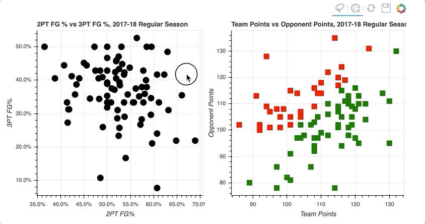
By selecting a random sample of data points in the upper right quadrant of the left scatter plot, those corresponding to both high two-point and three-point field goal percentage, the data points on the right scatter plot are highlighted.
Similarly, selecting data points on the right scatter plot that correspond to losses tend to be further to the lower left, lower shooting percentages, on the left scatter plot.
All the details on linking plots can be found at Linking Plots in the Bokeh User Guide.
Highlighting Data Using the Legend
That brings us to the final interactivity example in this tutorial: interactive legends.
In the Drawing Data With Glyphs section, you saw how easy it is to implement a legend when creating your plot. With the legend in place, adding interactivity is merely a matter of assigning a click_policy. Using a single line of code, you can quickly add the ability to either hide or mute data using the legend.
In this example, you’ll see two identical scatter plots comparing the game-by-game points and rebounds of LeBron James and Kevin Durant. The only difference will be that one will use a hide as its click_policy, while the other uses mute.
The first step is to configure the output and set up the data, creating a view for each player from the player_stats DataFrame:
# Bokeh Libraries
from bokeh.plotting import figure, show
from bokeh.io import output_file
from bokeh.models import ColumnDataSource, CDSView, GroupFilter
from bokeh.layouts import row

# Output inline in the notebook
output_file('lebron-vs-durant.html',
            title='LeBron James vs. Kevin Durant')

# Store the data in a ColumnDataSource
player_gm_stats = ColumnDataSource(player_stats)

# Create a view for each player
lebron_filters = [GroupFilter(column_name='playFNm', group='LeBron'),
                  GroupFilter(column_name='playLNm', group='James')]
lebron_view = CDSView(source=player_gm_stats,
                      filters=lebron_filters)

durant_filters = [GroupFilter(column_name='playFNm', group='Kevin'),
                  GroupFilter(column_name='playLNm', group='Durant')]
durant_view = CDSView(source=player_gm_stats,
                      filters=durant_filters)
Before creating the figures, the common parameters across the figure, markers, and data can be consolidated into dictionaries and reused. Not only does this save redundancy in the next step, but it provides an easy way to tweak these parameters later if need be:
# Consolidate the common keyword arguments in dicts
common_figure_kwargs = {
    'plot_width': 400,
    'x_axis_label': 'Points',
    'toolbar_location': None,
}
common_circle_kwargs = {
    'x': 'playPTS',
    'y': 'playTRB',
    'source': player_gm_stats,
    'size': 12,
    'alpha': 0.7,
}
common_lebron_kwargs = {
    'view': lebron_view,
    'color': '#002859',
    'legend': 'LeBron James'
}
common_durant_kwargs = {
    'view': durant_view,
    'color': '#FFC324',
    'legend': 'Kevin Durant'
}
Now that the various properties are set, the two scatter plots can be built in a much more concise fashion:
# Create the two figures and draw the data
hide_fig = figure(**common_figure_kwargs,
                  title='Click Legend to HIDE Data',
                  y_axis_label='Rebounds')
hide_fig.circle(**common_circle_kwargs, **common_lebron_kwargs)
hide_fig.circle(**common_circle_kwargs, **common_durant_kwargs)

mute_fig = figure(**common_figure_kwargs, title='Click Legend to MUTE Data')
mute_fig.circle(**common_circle_kwargs, **common_lebron_kwargs,
                muted_alpha=0.1)
mute_fig.circle(**common_circle_kwargs, **common_durant_kwargs,
                muted_alpha=0.1)
Note that mute_fig has an extra parameter called muted_alpha. This parameter controls the opacity of the markers when mute is used as the click_policy.
Finally, the click_policy for each figure is set, and they are shown in a horizontal configuration:
# Add interactivity to the legend
hide_fig.legend.click_policy = 'hide'
mute_fig.legend.click_policy = 'mute'

# Visualize
show(row(hide_fig, mute_fig))
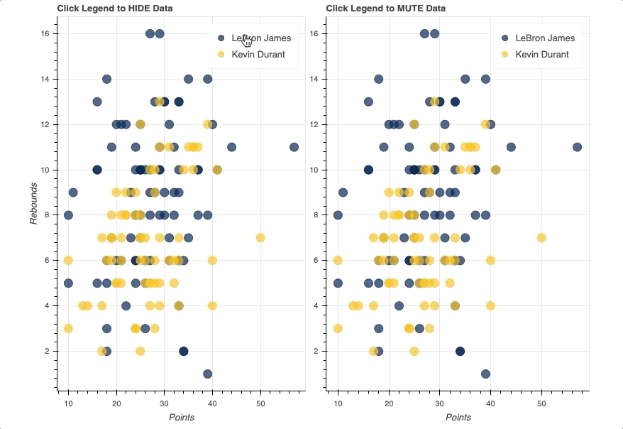
Once the legend is in place, all you have to do is assign either hide or mute to the figure’s click_policy property. This will automatically turn your basic legend into an interactive legend.
Also note that, specifically for mute, the additional property of muted_alpha was set in the respective circle glyphs for LeBron James and Kevin Durant. This dictates the visual effect driven by the legend interaction.
For more on all things interaction in Bokeh, Adding Interactions in the Bokeh User Guide is a great place to start.
Summary and Next Steps
Congratulations! You’ve made it to the end of this tutorial.
You should now have a great set of tools to start turning your data into beautiful interactive visualizations using Bokeh. You can download the examples and code snippets from the Real Python GitHub repo.
You learned how to:
- Configure your script to render to either a static HTML file or Jupyter Notebook
- Instantiate and customize the
figure()object - Build your visualization using glyphs
- Access and filter your data with the
ColumnDataSource - Organize multiple plots in grid and tabbed layouts
- Add different forms of interaction, including selections, hover actions, linking, and interactive legends
To explore even more of what Bokeh is capable of, the official Bokeh User Guide is an excellent place to dig into some more advanced topics. I’d also recommend checking out Bokeh’s Gallery for tons of examples and inspiration.
Watch Now This tutorial has a related video course created by the Real Python team. Watch it together with the written tutorial to deepen your understanding: Interactive Data Visualization in Python With Bokeh