Watch Now This tutorial has a related video course created by the Real Python team. Watch it together with the written tutorial to deepen your understanding: Creating Web Maps From Your Data With Python Folium
If you’re working with geospatial data in Python, then you might want to quickly visualize that data on a map. Python’s Folium library gives you access to the mapping strengths of the Leaflet JavaScript library through a Python API. It allows you to create interactive geographic visualizations that you can share as a website.
You’ll build the web map shown below, which displays the ecological footprint per capita of many countries and is based on a similar map on Wikipedia. Along the way, you’ll learn the basics of using Folium for data visualization.
In this tutorial, you’ll:
- Create an interactive map using Folium and save it as an HTML file
- Choose from different web map tiles
- Anchor your map to a specific geolocation
- Bind data to a GeoJSON layer to create a choropleth map
- Style the choropleth map
If you work through the tutorial, then your interactive map will look like this in the end:
In this tutorial, you’ll create HTML files that you can serve online at a static web hosting service.
An alternative workflow is to use Folium inside of a Jupyter notebook. In that case, the Folium library will render your maps directly in the Jupyter notebook, which gives you a good opportunity to visually explore a geographical dataset or include a map in your data science report.
If you click below to download the associated materials to this tutorial, then you’ll also get a Jupyter notebook set up with the code of this tutorial. Run the notebook to see how well Folium and Jupyter can play together:
Free Source Code: Click here to download the free source code for building web maps in Python with Folium.
Take the Quiz: Test your knowledge with our interactive “Python Folium: Create Web Maps From Your Data” quiz. You’ll receive a score upon completion to help you track your learning progress:
Interactive Quiz
Python Folium: Create Web Maps From Your DataPython’s Folium library gives you access to the mapping strengths of the Leaflet JavaScript library through a Python API. It allows you to create interactive geographic visualizations that you can share as a website.
Install Folium
To get started, create and activate a virtual environment and install folium and pandas. You can use the platform switcher below to see the relevant commands for your operating system:
You can use many features of Folium without pandas. However, in this tutorial you’ll eventually create a choropleth map using folium.Choropleth, which takes a pandas DataFrame or Series object as one of its inputs.
Create and Style a Map
A useful and beginner-friendly feature of Folium is that you can create a map with only three lines of code. The map looks good by default because the underlying Leaflet JavaScript library works well with a number of different tile providers, which provide high-quality map backgrounds for your web maps.
Note: A tile for a web map is an image or vector data file that represents a specific geographical area. Tiled web maps seamlessly join multiple tiles to present a geographical area that’s larger than a single tile.
Additionally, the library boasts attractive default styles for map features and gives you many options to customize the map to fit your needs exactly.
Display Your Web Map Tiles—in Style!
You want to show data on a world map, so you don’t even need to worry about providing any specific geolocation yet. Open up a new Python file in your favorite text editor and create a tiled web map with three lines of code:
import folium

m = folium.Map()
m.save("footprint.html")
When you run your script, Python creates a new HTML file in your working directory that displays an empty world map with the default settings provided by Folium. Open the file in your browser by double-clicking on it and take a look:
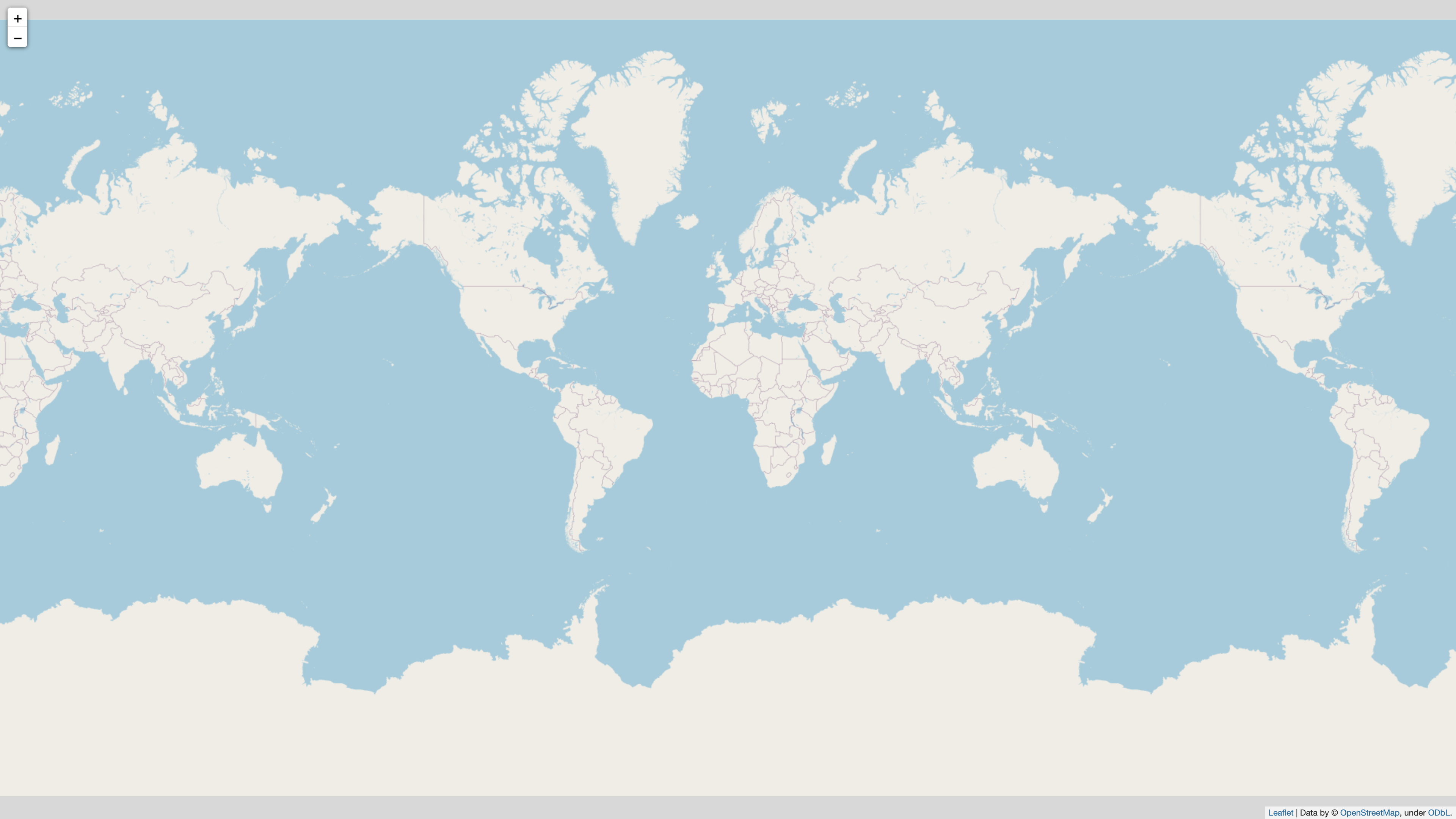
You now have a decent web map that already includes interactive controls in the top left corner. You can zoom further into the map and watch how the map details update as new web tiles load.
Note: You’re encouraged to choose a more descriptive name for the Map object. In this tutorial, you’ll stick with m to make it as straightforward as possible to continue your learning in the quickstart section of Folium, which uses the same variable name.
The default tiles that the library provides come from OpenStreetMap. However, you can change the style of your map by specifying a different string for the tiles parameter, which loads the web tiles from a different tile provider:
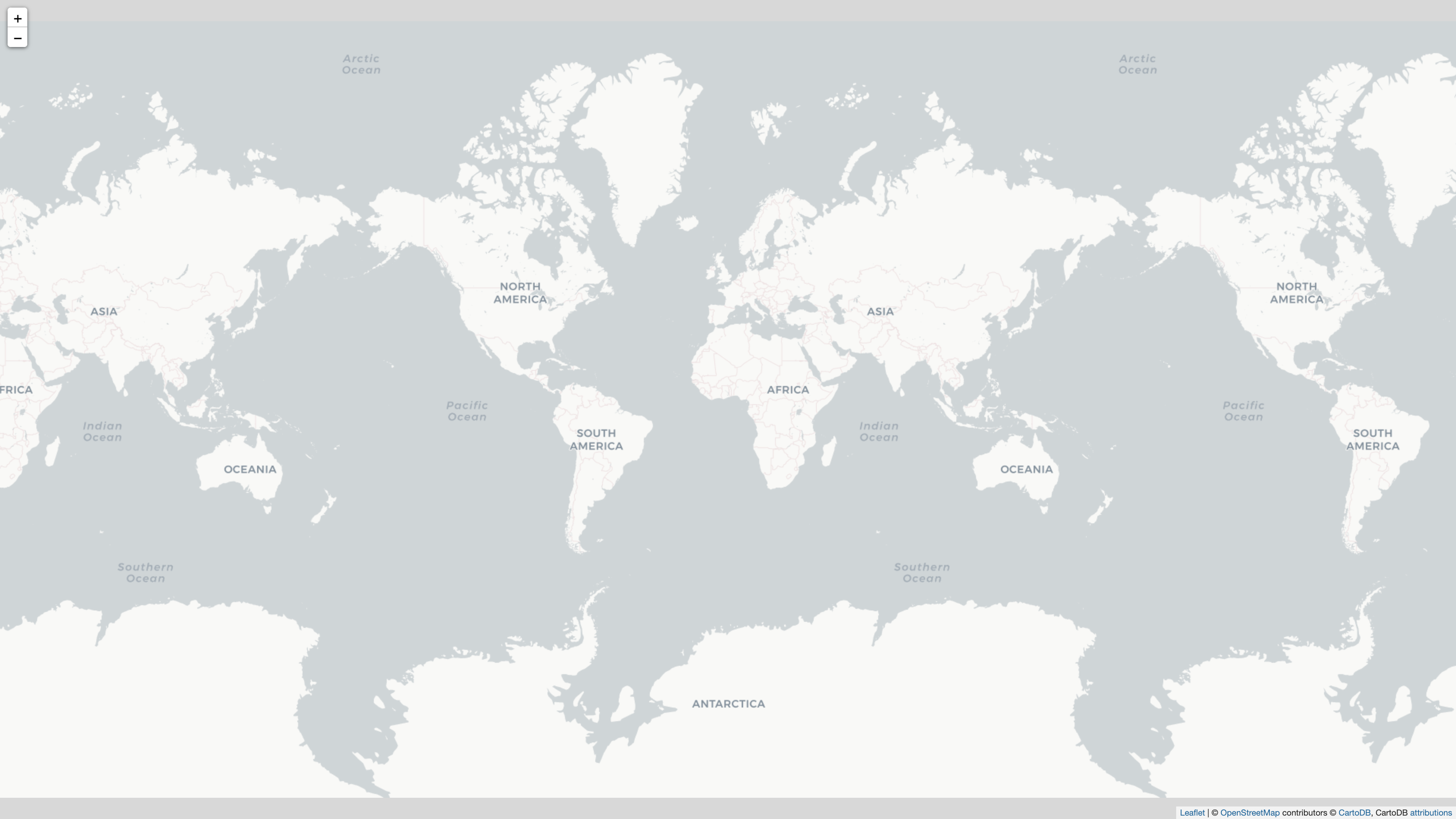
import folium

m = folium.Map(tiles="cartodb positron")
m.save("footprint.html")
Run your updated script and reload the page in your browser. You’ll see that the style of the world map has changed. The Positron basemap by Carto and Stamen is designed to give viewers geospatial context while keeping the visual impact of the basemap minimal so that you can showcase your own data:
The Folium library also provides other built-in map tiles that you can choose from by changing the argument that you pass to tiles. You can even provide a Leaflet-style URL to a custom tile set.
Add a Geolocation and Adjust the Zoom Level
You may not always have data that concerns the whole world. If you want to display only a specific area of the globe, then you can add values to another parameter when creating the Map object:
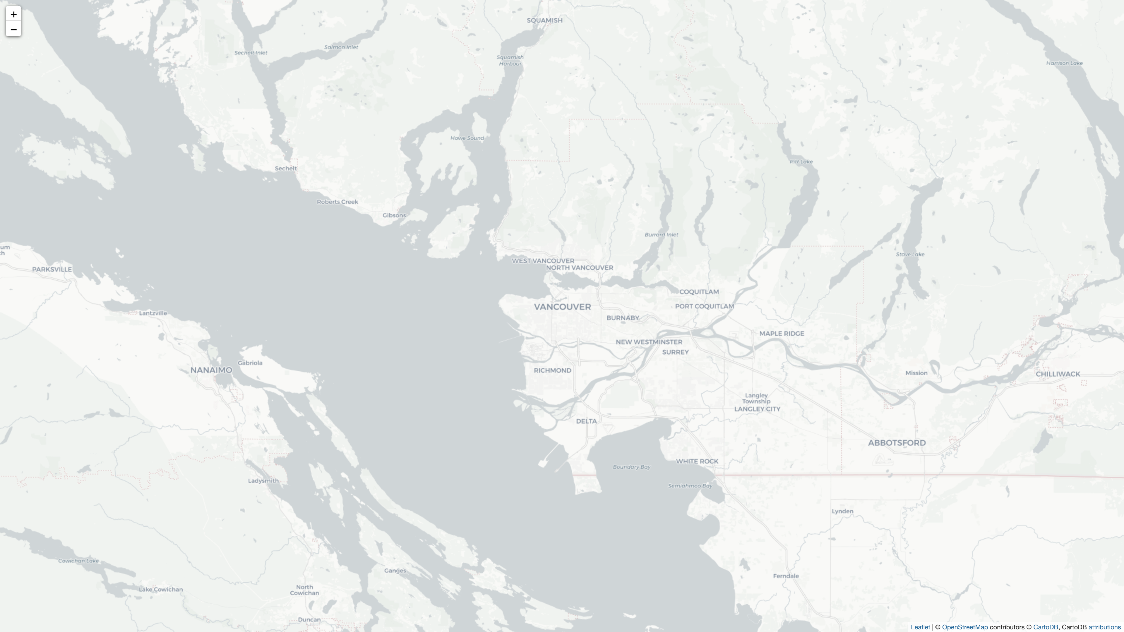
import folium

m = folium.Map(location=(49.25, -123.12), tiles="cartodb positron")
m.save("footprint.html")
For example, if you enter a tuple with the latitude and longitude shown in the code snippet above, then the resulting map is focused on Vancouver, Canada:
However, in this tutorial, you want to build a political world map, so it should show a clean view of all continents. Earlier, you didn’t pass any geolocation, so the map zoomed out too far. Because in reality there is no planet B, you could set the center location of your map northeast of Null Island and adjust the start zoom level to get a map that fits your purpose well:
import folium

m = folium.Map(location=(30, 10), zoom_start=3, tiles="cartodb positron")
m.save("footprint.html")
In this code, you’ve changed the location coordinates and passed 3 to zoom_start. This change focuses the world map on a position that gives you a good view of the world’s political organization into countries:
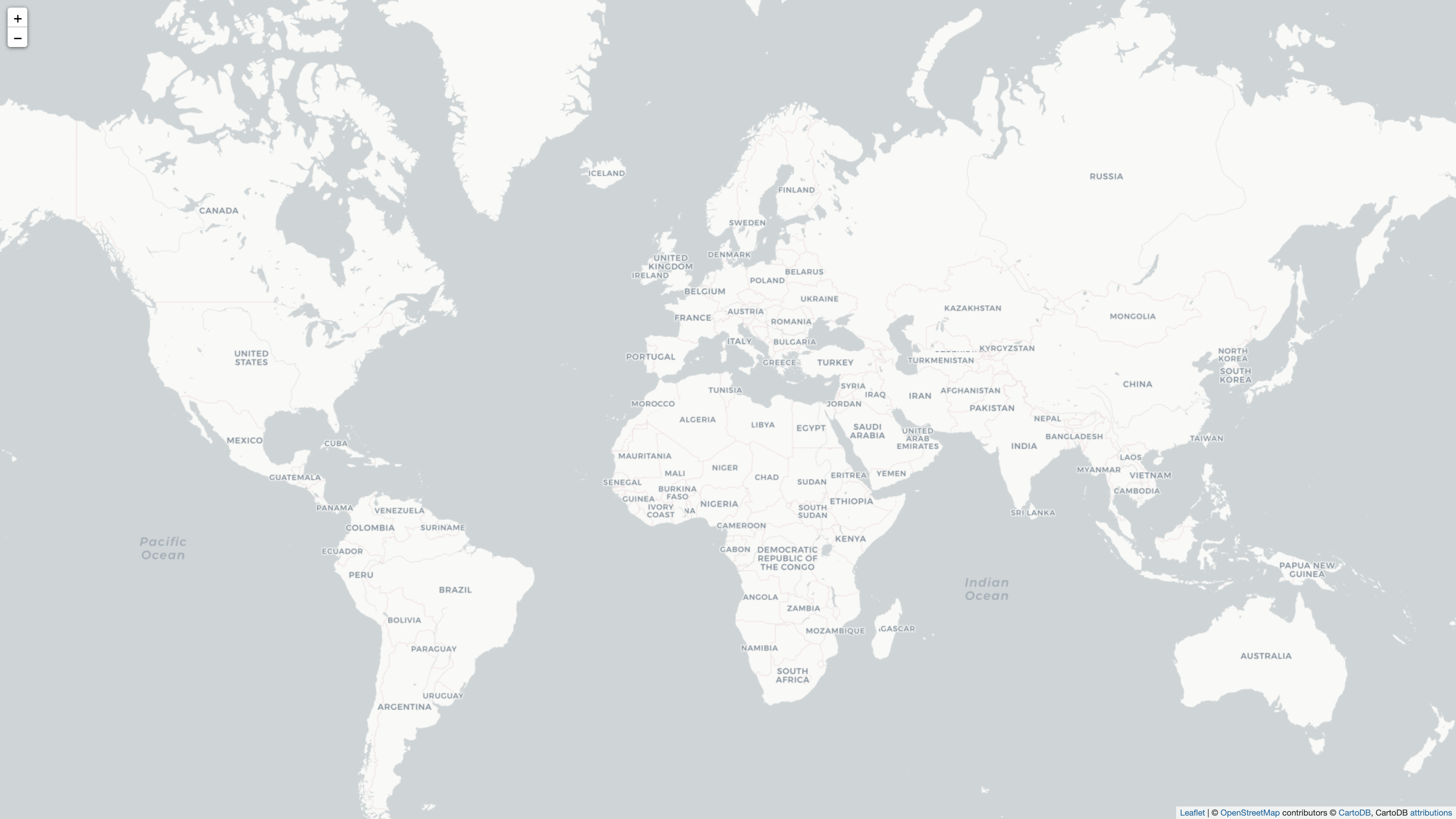
Note that the right zoom start level will depend on your screen size, so feel free to experiment with a different setting that fits you better. Also keep in mind that there might not be a zoom level and position to display the world map perfectly using the Mercator projection—although this setting does include New Zealand! Your users can also zoom and move in their browsers because the map is interactive.
Add a GeoJSON Countries Layer
At this point, you have a good-looking world map as a basemap, and you have the means to style it. Ultimately, you want to get to a point where you can plot your country-specific data on top of this map. For that, you need a layer that you can connect to your data. The ecological footprint data that you’ll work with is linked to political countries, so you’ll need information that defines the boundaries of each country separately.
Note: While you can see country borders on the basemap, keep in mind that this is a tiled web map that consists of many individual images stitched together. Which tiles you’re viewing also depends on the zoom level. Therefore, you can’t access the outlines or the area of a country on the existing tiled web map layer.
A good approach to create an additional layer that describes country boundaries is by linking to a GeoJSON file. If you don’t have a fitting GeoJSON file handy, then you can link directly to a URL that provides such a file for you.
In this tutorial, you’ll use GeoJSON data created by the Natural Earth project and provided through the geojson.xyz service.
Note: You’re not tied to using these services and can provide a different GeoJSON source. For example, you could build your own GeoJSON data by using the visual web tool at geojson.io.
You’ll use the data from the resource called admin 0 countries, because it provides relatively high-quality data on political borders of countries. Create this additional map layer by passing the direct data URL to GeoJson:
 1import folium
 2
 3political_countries_url = (
 4    "http://geojson.xyz/naturalearth-3.3.0/ne_50m_admin_0_countries.geojson"
 5)
 6
 7m = folium.Map(location=(30, 10), zoom_start=3, tiles="cartodb positron")
 8folium.GeoJson(political_countries_url).add_to(m)
 9
10m.save("footprint.html")
In lines 3 to 5, you added the direct data URL as political_countries_url to your script. In line 8, you passed the URL as an argument to folium.GeoJson. In the same line, you chained a call to .add_to() at the end of your code and passed your Map object (m) to the method.
With this code, you asked Folium to create a new vector layer on top of your world map using the GeoJSON provided at the given URL. Run your script again to replace the old HTML file, then refresh your browser to see the updates:
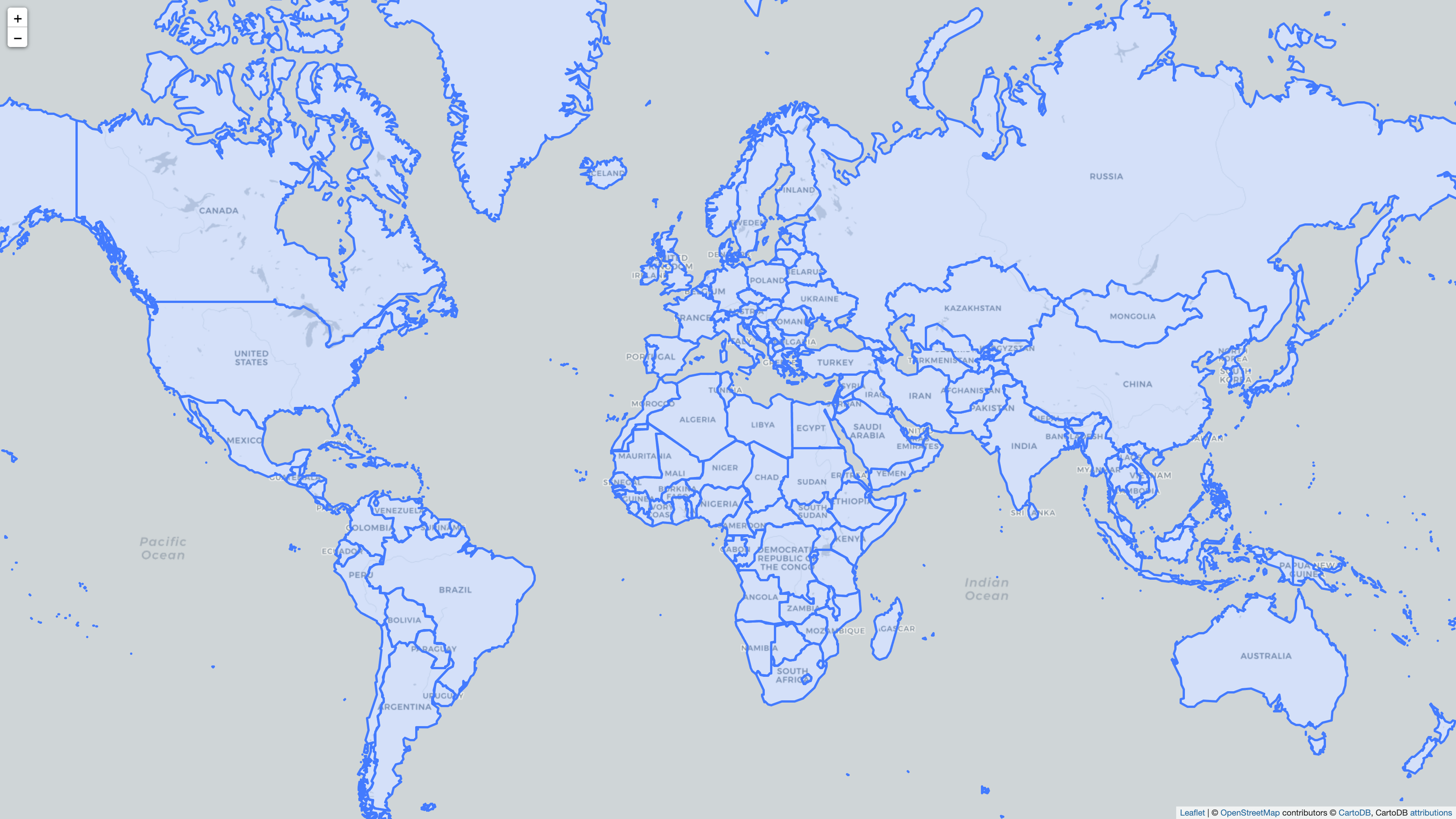
Your world map now has an additional layer that displays the GeoJSON features that represent the political countries of the world. Great! Now it’s time to connect the individual countries with your data and create a choropleth map.
Create a Choropleth Map With Your Data
Now that you’ve added a vector layer representing political countries to your world map, you can connect that layer with country-specific data. You can fill the GeoJSON features with different colors depending on their associated data values. Such a map is called a choropleth map.
In this tutorial, you’ll create a map that’s based on a map from Wikipedia that visually displays the ecological footprint per capita for many countries:
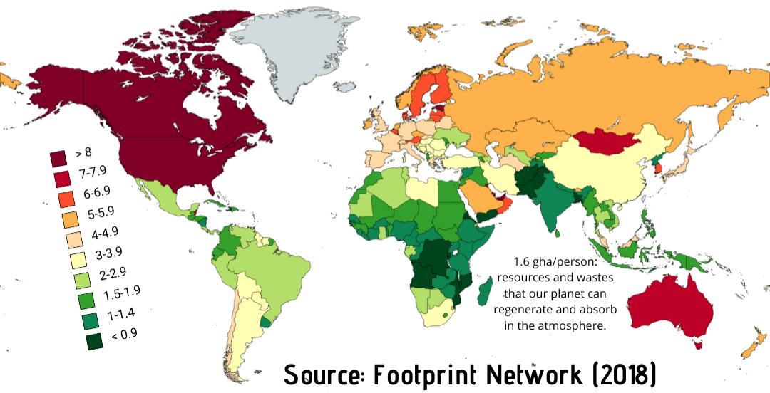
Your final map won’t look exactly the same, but it’ll be quite similar to the Wikipedia map shown above. Because you’re building the map as an interactive web map, viewers will also be able to zoom and pan around the map to inspect parts of it in more detail.
Get Data on Ecological Footprint Per Capita
You’ll map the data from the countries and regions table in Wikipedia’s list of countries by ecological footprint onto your world map. You can download a CSV file with the data below:
Free Source Code: Click here to download the free source code for building web maps in Python with Folium.
The CSV file contains the information as it’s currently shown on Wikipedia, which is based on data gathered by York University, the Footprint Data Foundation, and the Global Footprint Network:
Rank,Country/region,Ecological footprint,Biocapacity,Biocapacity deficit or reserve,Population (millions),Total biocapacity deficit or reserve (gMha),Population (millions) for biocapacity to equal ecological footprint *(gha/person)
0,World,2.75,1.63,-1.12,7753,-10400,2500
1,Luxembourg,15.82,1.68,-14.14,0.63,-7.35,0.055221
2,Aruba,11.88,0.57,-11.31,0.17,-1.13,0.004798
3,Qatar,10.8,1.24,-9.56,2.05,-19.60,0.23537
4,Australia,9.31,16.57,7.26,23.05,167.34,41.02454
5,United States,8.22,3.76,-4.46,329.5,-1416.05,145.2311
...
Feel free to use a different dataset if you want to plot your own data on the map. After you’ve downloaded the data, you can use pandas to load the footprint.csv data into your script:
 1import folium
 2import pandas as pd
 3
 4eco_footprints = pd.read_csv("footprint.csv")
 5political_countries_url = (
 6    "http://geojson.xyz/naturalearth-3.3.0/ne_50m_admin_0_countries.geojson"
 7)
 8
 9m = folium.Map(location=(30, 10), zoom_start=3, tiles="cartodb positron")
10folium.GeoJson(political_countries_url).add_to(m)
11
12m.save("footprint.html")
You add an import for pandas in line 2, then import the data using read_csv() in line 4. With that, you now have access to the ecological footprint data as a pandas DataFrame in your script, and you’re ready to add it to your map.
Add the Data to Your Map
A visually interesting way of plotting country-specific data on a map is a choropleth map, which means that you color geographical units based on aggregated values. The Folium library provides a Choropleth class for creating a choropleth map layer.
You can replace the GeoJson layer that you created earlier with a Choropleth layer that’ll take both the GeoJSON and the ecological footprint data as input:
 1import folium
 2import pandas as pd
 3
 4eco_footprints = pd.read_csv("footprint.csv")
 5political_countries_url = (
 6    "http://geojson.xyz/naturalearth-3.3.0/ne_50m_admin_0_countries.geojson"
 7)
 8
 9m = folium.Map(location=(30, 10), zoom_start=3, tiles="cartodb positron")
10folium.Choropleth(
11    geo_data=political_countries_url,
12    data=eco_footprints,
13    columns=["Country/region", "Ecological footprint"],
14    key_on="feature.properties.name",
15).add_to(m)
16
17m.save("footprint.html")
To set up a choropleth map with Folium, you need to provide two datasets:
geo_datatakes a path to the GeoJSON geometries. In this case, you’re passing a URL, but you could also use a local file path or provide the data directly.datatakes the ecological footprint data that you’ve loaded into a pandas DataFrame.
Finally, you also need to specify how to connect these two datasets with each other:
-
columnstakes a tuple with the names of the two DataFrame columns that you want to use for the map. The first item should be the key that’ll connect the ecological footprint data with the GeoJSON data. In this case, you choose the"Country/region"column as that key. The second item points to the data that you want to bind to the GeoJSON geometries, and that’s the data in the column named"Ecological footprint". -
key_ontakes a string in dot notation that specifies the variable in the GeoJSON data that represents the other part of the data link. For this map project, you choose to connect to the"name"key of a country’s GeoJSON data. You can find this key underproperties.namefor each feature.
Depending on what dataset you work with, you may want to choose different keys both in your DataFrame and in the GeoJSON data.
If you want to learn how to find the right key in a GeoJSON structure, then you can expand the collapsible section below:
You must start the key_on parameter with "feature" and then follow it with a dot-notation path to the value that you want to link. This might not seem intuitive when you first look at the content of a GeoJSON file:
{
    "type": "FeatureCollection",
    "features": [
        {
            "type": "Feature",
            "properties": {
                "scalerank": 1,
                "labelrank": 3,
                "sovereignt": "Afghanistan",
                "sov_a3": "AFG",
                "adm0_dif": 0,
                "level": 2,
                "type": "Sovereign country",
                "admin": "Afghanistan",
                "adm0_a3": "AFG",
                "geou_dif": 0,
                "geounit": "Afghanistan",
                "gu_a3": "AFG",
                "su_dif": 0,
                "subunit": "Afghanistan",
                "su_a3": "AFG",
                "brk_diff": 0,
                "name": "Afghanistan",
                "name_long": "Afghanistan",
                "brk_a3": "AFG",
                // ...
            },
            "geometry": {
                "type": "Polygon",
                "coordinates": [
                    [
                        [
                            61.210817091725744,
                            35.650072333309225
                        ],
                        [
                            62.230651483005886,
                            35.270663967422294
                        ],
                        // ...
                    ]
                ]
            }
        },
        // ...
    ]
}
The geographical features, each representing a country in this case, are collected in a JSON array that’s keyed on "features".
The library then iterates over this array and accesses each individual feature under the variable "feature", which is why Folium can get to the highlighted element of each feature through the path "feature.properties.name".
Finding the right key in your GeoJSON data and constructing the string that points to it can be tricky. But once you’ve successfully connected the two datasets, you can run the script another time to see the ecological footprint data displayed as a choropleth on your world map:
Great, your data is mapped onto the GeoJSON layer! The countries are colored differently based on the data values of their respective ecological footprints. And in the top right of the page, you even have a legend.
But this map doesn’t look quite as meaningful as the map that you saw on Wikipedia. The default blue color scheme doesn’t seem to express the urgency of the situation well, and the dark gray areas that represent missing data take up too much of the viewers’ attention. Fortunately, Choropleth has additional parameters that you can use to customize your map layer.
Style Your Folium Map
To successfully communicate a message through data visualization, you need to understand your dataset and the story that you want to tell. Often it can help to iterate over your draft in order to find the visualization that works best. The Folium library allows you to tap into the power of Leaflet to modify your maps with additional parameters.
Adapt the Color Scheme and Opacity
Previously, you’ve identified that the default blue color scheme isn’t a great fit for the map that you want to build, so you want to switch it out for a different color scheme. You also noticed that missing data sticks out too much, so you’ll try to reduce the visual impact of missing data. Finally, adding a descriptive name for your legend will make the map a lot more user-friendly:
 1import folium
 2import pandas as pd
 3
 4eco_footprints = pd.read_csv("footprint.csv")
 5political_countries_url = (
 6    "http://geojson.xyz/naturalearth-3.3.0/ne_50m_admin_0_countries.geojson"
 7)
 8
 9m = folium.Map(location=(30, 10), zoom_start=3, tiles="cartodb positron")
10folium.Choropleth(
11    geo_data=political_countries_url,
12    data=eco_footprints,
13    columns=("Country/region", "Ecological footprint"),
14    key_on="feature.properties.name",
15    fill_color="RdYlGn_r",
16    fill_opacity=0.8,
17    line_opacity=0.3,
18    nan_fill_color="white",
19    legend_name="Ecological footprint per capita",
20).add_to(m)
21
22m.save("footprint.html")
In this code snippet, you updated the parameters that you use with Choropleth in order to improve the visual display of your map layer:
-
Line 15 introduces
fill_color, which you can set to any Brewer color palette. You chose"RdYlGn_r", a divergent color scheme that aims to highlight the extreme values on both the high and the low ends. -
Line 16 adds
fill_opacitywith a value of0.8. This setting changes the transparency of the fill color so that it becomes slightly translucent. -
Line 17 sets
line_opacityto0.3to de-emphasize both the border lines, which already show through the different fill colors for the countries, and the underlying world map, which is visible due to the adjusted translucency. -
Line 18 changes the default fill color for missing values from black to white by adding the color name as a string to
nan_fill_color. -
Line 19 adds a title to the legend in the top right of the map. This makes the map much more useful, because it allows your viewers to understand what data you’re displaying.
With these adaptations in place, your map looks closer to the map that you’re modeling it on, and it’s more user-friendly overall:
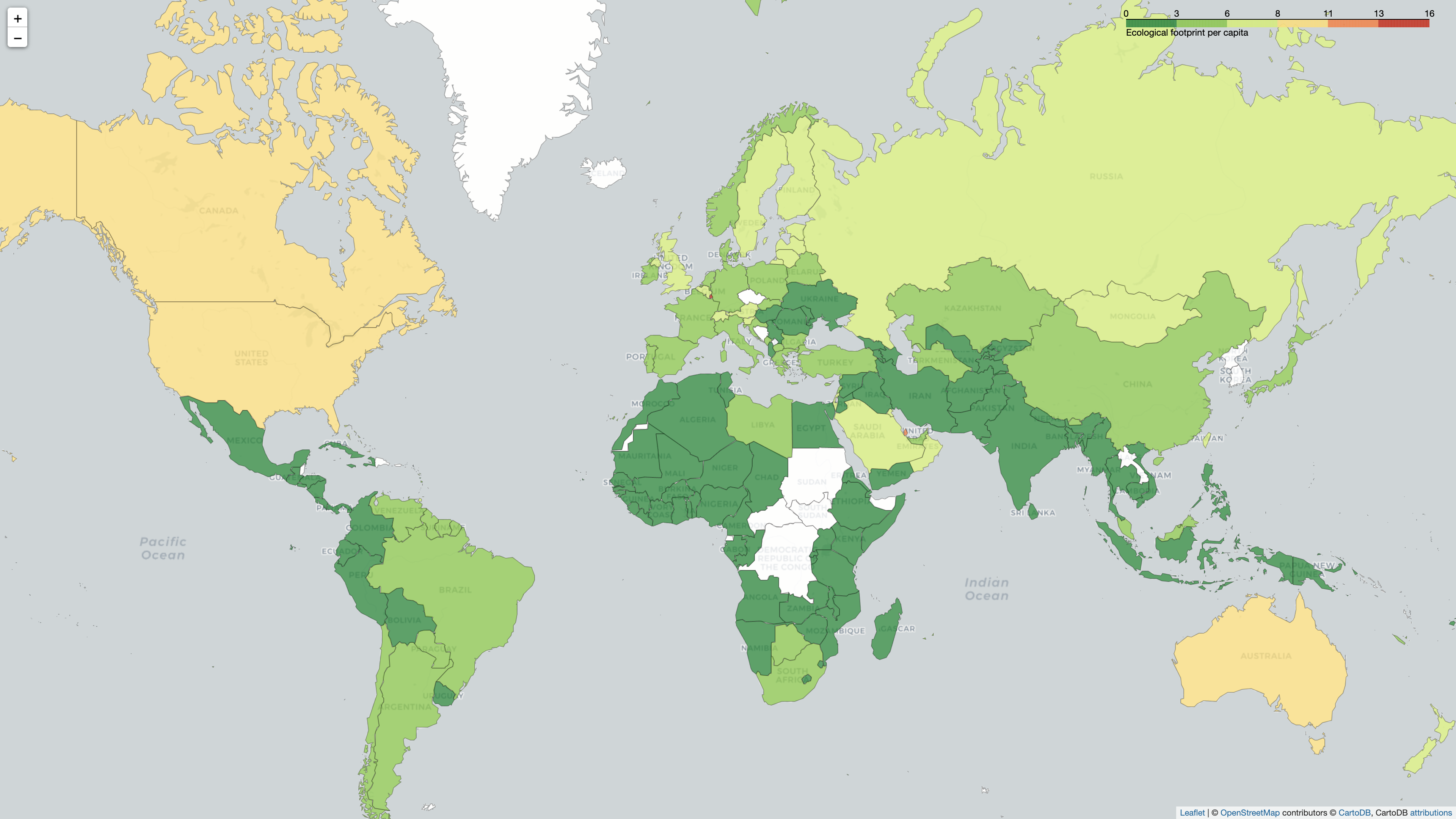
Where are the countries that have the highest ecological footprint per capita? Can you find the red dots by zooming in on the map? Those are a few small countries that have a very high ecological footprint per capita.
Note: The Brewer color theme that you used, "RdYlGn", shows low values as red and high values as green by default. But that default color scheme would be more difficult for viewers to parse because red and green have established meanings. People associate red with potentially dangerous situations and think of green as signifying that everything is okay.
Therefore, you want to highlight countries where people live beyond the means of our planet’s resources in red colors and countries that don’t in green. You can reverse the direction of a Brewer color scheme by adding _r at the end of the color palette’s name, which you’ve done above.
While the map looks better than before, the current color spread doesn’t really show which countries have the highest ecological impact overall. You’ll improve the visual story a bit more by introducing custom binning next.
Use Custom Data Binning
There are only a few countries with a very large ecological footprint value per capita, and these countries are quite small. This is interesting to keep in mind, but it doesn’t work in favor of a world map view that aims to show high-impact and low-impact countries. Even if a small country has a high ecological footprint per capita, a more populous country with a slightly smaller ecological footprint per capita will have a higher impact overall.
The map on Wikipedia therefore introduces a custom data binning that, for example, lumps all values higher than 8 into one bin. This approach also highlights larger countries with a high ecological footprint per capita. You can follow suit and use another parameter of Choropleth to define a custom binning for your data:
 1import folium
 2import pandas as pd
 3
 4eco_footprints = pd.read_csv("footprint.csv")
 5max_eco_footprint = eco_footprints["Ecological footprint"].max()
 6political_countries_url = (
 7    "http://geojson.xyz/naturalearth-3.3.0/ne_50m_admin_0_countries.geojson"
 8)
 9
10m = folium.Map(location=(30, 10), zoom_start=3, tiles="cartodb positron")
11folium.Choropleth(
12    geo_data=political_countries_url,
13    data=eco_footprints,
14    columns=("Country/region", "Ecological footprint"),
15    key_on="feature.properties.name",
16    bins=[0, 1, 1.5, 2, 3, 4, 5, 6, 7, 8, max_eco_footprint],
17    fill_color="RdYlGn_r",
18    fill_opacity=0.8,
19    line_opacity=0.3,
20    nan_fill_color="white",
21    legend_name="Ecological footprint per capita",
22).add_to(m)
23
24m.save("footprint.html")
You fetch the maximum ecological footprint value of all countries in line 5 and save it to max_eco_footprint. This value is the upper bound for your custom binning. In line 16, you then use it together with the same steps as in the Wikipedia map to define custom bins for your dataset. Take another look at your map:
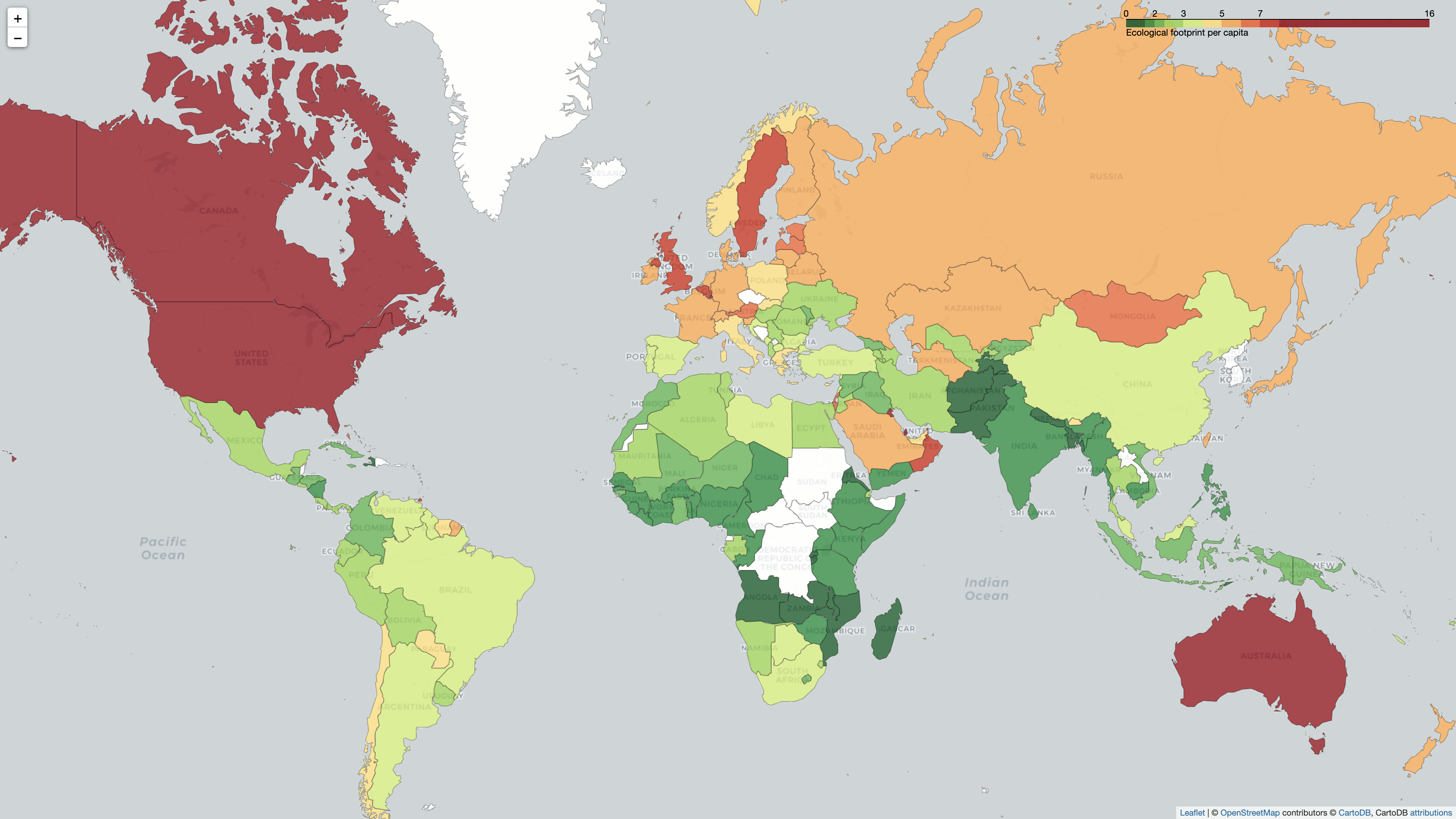
After applying the custom binning to your data, the map better represents the impact of all countries with a relatively high ecological footprint per capita. It does that by moving the breakpoints for the color palette so that all countries with a high ecological footprint show up in red or variations of red. This more effectively raises awareness of the potential danger that can come from living above the means of our planet’s resources.
Add a Layer Control Element
As a final user experience improvement, you can also name your choropleth map layer and add a LayerControl element to the map so that your viewers can toggle the choropleth layer:
import folium
import pandas as pd

eco_footprints = pd.read_csv("footprint.csv")
max_eco_footprint = eco_footprints["Ecological footprint"].max()
political_countries_url = (
    "http://geojson.xyz/naturalearth-3.3.0/ne_50m_admin_0_countries.geojson"
)

m = folium.Map(location=(30, 10), zoom_start=3, tiles="cartodb positron")
folium.Choropleth(
    geo_data=political_countries_url,
    data=eco_footprints,
    columns=("Country/region", "Ecological footprint"),
    key_on="feature.properties.name",
    bins=(0, 1, 1.5, 2, 3, 4, 5, 6, 7, 8, max_eco_footprint),
    fill_color="RdYlGn_r",
    fill_opacity=0.8,
    line_opacity=0.3,
    nan_fill_color="white",
    legend_name="Ecological footprint per capita",
    name="Countries by ecological footprint per capita",
).add_to(m)
folium.LayerControl().add_to(m)

m.save("footprint.html")
These two additional lines of code further improve the usability of your map by giving the choropleth map layer a descriptive name and allowing your viewers to toggle it:
Your map looks great and resembles the Wikipedia map that’s based on the same data. What’s even better is that your map is interactive and allows viewers to zoom and move without the need for you to code that functionality yourself. Because you added the LayerControl element, they can now even toggle the choropleth layer seamlessly.
However, the map isn’t perfect. There’s room for improvement in both data and design. If you want to train your data visualization skills, take note of the potential issues that you can think of with the map in its current state. Then, read on for some improvement suggestions.
Next Steps
The map that you built looks good, and while building it, you worked with a few different aspects of Folium. However, you might have discovered some issues with the final map.
One potential issue with your map is what areas you display as political units. People around the world may have different opinions on what regions should be considered separate political countries, or where to draw the borders. When you build a map, you might have to question your assumptions and what worldview you propagate with your map design.
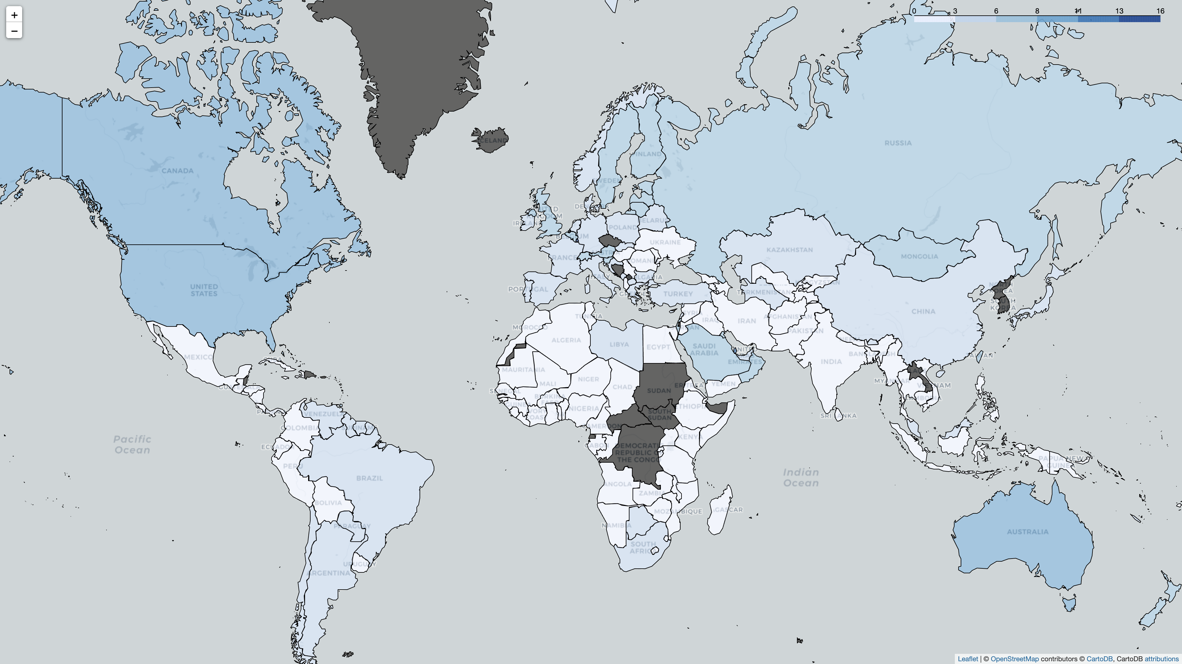
Another issue is that multiple countries show up as missing values on your map even though there’s data for some of these countries in your CSV file. In these cases, linking the GeoJSON country feature and the row information from your CSV file didn’t work out.
Note: The linking failures are most likely due to the two datasets’ spelling a country name differently. For example, while the Czech Republic is noted as Czech Republic in the CSV file, it shows up as Czech Rep. under feature.properties.name in the GeoJSON data.
You could try to key the two datasets on a different property of the country features, but you’ll probably notice that this just moves the issue from some countries to other countries. Data is never completely clean, so you might instead want to look into cleaning your data with pandas before linking it to your GeoJSON features.
The bin colors also leave room for improvement. While you’ve bumped into the limitations of what you can do by passing parameters in Choropleth, you can apply a lot more style customization on a GeoJson object by using style_function(). Can you edit your code so that the resulting map resembles the one on Wikipedia even more closely?
Finally, if you’re done with this map project but want to learn more about using Folium for your next project, then you can learn about adding markers to your Folium maps. Once you know about markers, you can build a location-based web app with Django and GeoDjango and show the locations on a web map using Folium.
Conclusion
Well done making it to the end of this tutorial! You built a choropleth map using Python’s Folium library. At the same time, you trained your data visualization skills and added Folium as a new tool to your tool belt.
In this tutorial, you’ve learned how to:
- Create an interactive map using Folium and save it as an HTML file
- Choose from different web map tiles
- Anchor your map to a specific geolocation
- Bind data to a GeoJSON layer to create a choropleth map
- Style the choropleth map
If you’re working with data that has a geographical component, then try to use Folium to visualize it and gain additional insights. Additionally, you can create a report that your colleagues and the Internet will want to look at and that you can share as a static website.
Did you like using Folium to visualize your data? Did you work with a different dataset? What features of the library would you like to learn more about? Leave a note in the comments below and keep on mapping!
Free Source Code: Click here to download the free source code for building web maps in Python with Folium.
Take the Quiz: Test your knowledge with our interactive “Python Folium: Create Web Maps From Your Data” quiz. You’ll receive a score upon completion to help you track your learning progress:
Interactive Quiz
Python Folium: Create Web Maps From Your DataPython’s Folium library gives you access to the mapping strengths of the Leaflet JavaScript library through a Python API. It allows you to create interactive geographic visualizations that you can share as a website.
Watch Now This tutorial has a related video course created by the Real Python team. Watch it together with the written tutorial to deepen your understanding: Creating Web Maps From Your Data With Python Folium


