
Join us and get access to thousands of tutorials and a community of expert Pythonistas.
This lesson is for members only. Join us and get access to thousands of tutorials and a community of expert Pythonistas.
Matplotlib and Pandas

Now that you’ve seen how to build a histogram in Python from the ground up, let’s see how other Python packages can do the job for you. Matplotlib provides the functionality to visualize Python histograms out of the box with a versatile wrapper around NumPy’s histogram():
import matplotlib.pyplot as plt

# An "interface" to matplotlib.axes.Axes.hist() method
n, bins, patches = plt.hist(x=d, bins='auto', color='#0504aa',
                            alpha=0.7, rwidth=0.85)
plt.grid(axis='y', alpha=0.75)
plt.xlabel('Value')
plt.ylabel('Frequency')
plt.title('My Very Own Histogram')
plt.text(23, 45, r'$\mu=15, b=3$')
maxfreq = n.max()
# Set a clean upper y-axis limit.
plt.ylim(ymax=np.ceil(maxfreq / 10) * 10 if maxfreq % 10 else maxfreq + 10)
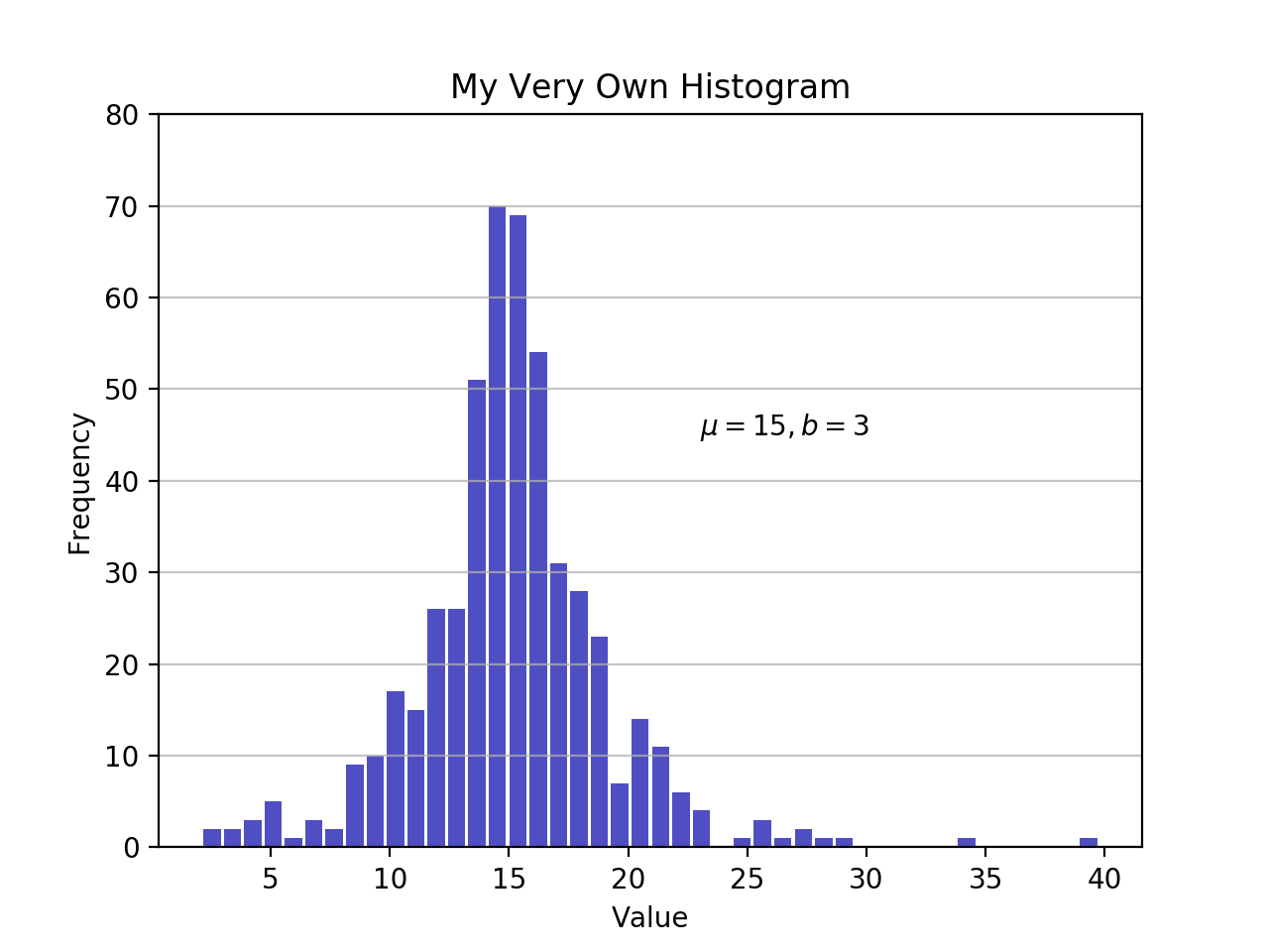
As defined earlier, a plot of a histogram uses its bin edges on the x-axis and the corresponding frequencies on the y-axis. In the chart above, passing bins='auto' chooses between two algorithms to estimate the ideal number of bins. At a high level, the goal of the algorithm is to choose a bin width that generates the most faithful representation of the data. For more on this subject, which can get pretty technical, check out Choosing Histogram Bins from the Astropy docs.
Staying in Python’s scientific stack, Pandas’ Series.histogram() uses matplotlib.pyplot.hist() to draw a Matplotlib histogram of the input Series:
import pandas as pd

# Generate data on commute times.
size, scale = 1000, 10
commutes = pd.Series(np.random.gamma(scale, size=size) ** 1.5)

commutes.plot.hist(grid=True, bins=20, rwidth=0.9,
                   color='#607c8e')
plt.title('Commute Times for 1,000 Commuters')
plt.xlabel('Counts')
plt.ylabel('Commute Time')
plt.grid(axis='y', alpha=0.75)

pandas.DataFrame.histogram() is similar but produces a histogram for each column of data in the DataFrame.
00:00 While it was cool to use NumPy to set bins in the last video, the result was still just a printout of an array of values, and not very visual. After this video, you’ll be able to make some charts, however, using Matplotlib and Pandas. If you’ve ever used MATLAB, Matplotlib might feel a bit familiar as that’s where it drew its inspiration from.
00:20
Go ahead and import matplotlib.pyplot as plt. And using the same dataset from earlier, create a histogram. So n, bins, patches from plt.hist(), set x equal to the dataset, bins to 'auto'.
00:49
You can select a color using hexadecimal values.
01:07
And alpha=0.7, which just sets some transparency—and that shouldn’t be a string, also. And rwidth=0.85. So, with plt, you can set a grid, have an axis='y', set the value=0.75,
01:40
set your x label to 'Value',
01:49
the y label to 'Frequency'. And you can go ahead and set a title, also.
02:08
And if you want to overlay some text onto the chart, you can just call text(), set the position, then you want to get the special character for mu, for the mean.
02:29
Identify a max frequency—that’s just the max number of occurrences from this n value up here. And you can set the y limit. And this is now called top, this is just going to be np.ceil() for, like, ceiling.
02:55
Pass in that maxfreq that you calculated, divide that by 10 times 10 if maxfreq is evenly divisible by 10, else maxfreq, just add 10. All right.
03:20
And since I am running this as a script file, just call plt.show(). Open up a terminal and run it! Aha, invalid syntax. It should be somewhere around this alpha=0.7, which it is. I forgot a comma.
03:43 And let’s try that again.
03:51
And this is interesting here. Let’s see what we’ve got. grid_value is not recognized. So… And yes! grid() does not know what value is—it’s looking for alpha.
04:10 Third time’s the charm, right? All right, look at that. So this—and let me see if I can pull this up—actually gives you a pretty cool plot here. You can see all your data laid out.
04:26 The parameters for the Laplace distribution are printed out here and you have that special character for mu. You have your values that define where your bins are set, and then the frequency that each bin has a value. Matplotlib also gives you a couple options up here, where if you wanted to, you could almost like—yeah, you can zoom in, focus in on certain areas, you can move the chart around.
04:51 So, it gives you some interactivity. That’s pretty cool. I’m going to close this out and let’s hop back over. Close out the terminal. Now, you can go ahead, delete all of this, and you’re going to see how you could use Pandas to make histograms.
05:09
So import pandas as pd. And Pandas is actually going to use Matplotlib for its plotting. But where Pandas is useful is that it’s such a common way to store your data, in DataFrames, it actually has a wrapper set up where you can just call the Matplotlib plots from Pandas.
05:34
So go ahead and make size, scale = 1000, 10. And then you’re going to make a Series called commutes that’s just going to be equal to a Pandas Series().
05:48
Pass in a np.random.gamma() for scale, and then size=size,
06:01
and then just raise that to the 1.5 power.
06:09
And it would help if you set that = instead of just a space. And now that commutes is a Pandas Series, it actually has a .plot() method in there which will let you plot a histogram.
06:23
You can just say grid=True. Go ahead and make 20 bins there. You can set your rwidth also,
06:40
and set the color to something like '#607c8e'. And then using the Matplotlib plt, you can set a title,
06:58
'Commute Times for 1,000 Commuters'.
07:12
Like before, you can set your x label, 'Counts', and a y label, which in this case would be something like 'Commute Time'. And then set the plt.grid() so the axis='y' and alpha=0.75.
07:39
Finally, plt.show(). Save that, and let’s run it! And look at that! Your data is now in a histogram straight out of a Pandas DataFrame—or, rather, a Pandas Series, in this case.
07:58
If you were to use a DataFrame and pass that in and try to plot it, you would generate a plot for each column in that DataFrame.
08:06 So that can be a handy way of generating a lot of charts very quickly. Now, if you notice here, I made a bit of an error, as the Commute Time is on the y label and the Counts is on the x label. These should be switched. Generally, your frequencies will be your y-axis and then whatever value you’re trying to measure would be what you plot on your x-axis. All right!
08:31 So now with that, you’ve got a couple different ways to make some very nice looking charts using Matplotlib and Pandas. In the next video, you’ll get to take a look at kernel density estimates, which can be thought of as a way to smooth out your data when you’re plotting it from a histogram. Thanks for watching.
Become a Member to join the conversation.
williamjarrold on April 24, 2020
Hi,
The first script did not work the first time because it does not define the variable d. One simply needs to add…
np.random.seed(444) np.set_printoptions(precision=3)
d = np.random.laplace(loc=15, scale=3, size=500)
…to the top to make it work (it’s from the prior section of the course)
Also, after I made the addition and ran it from Terminal on my Mac, it did not display. Thanks to stackoverflow.com/questions/2512225/matplotlib-plots-not-showing-up-in-mac-osx I fixed this problem by adding....
plt.show()
… to the last line of the script. If there are better / alternative ways of getting the display to work, I’m interested. (-: